 打开微信扫一扫
复制链接

展示空间设计 全球五强
获奖者:黄晓群
获奖作品:無色解构
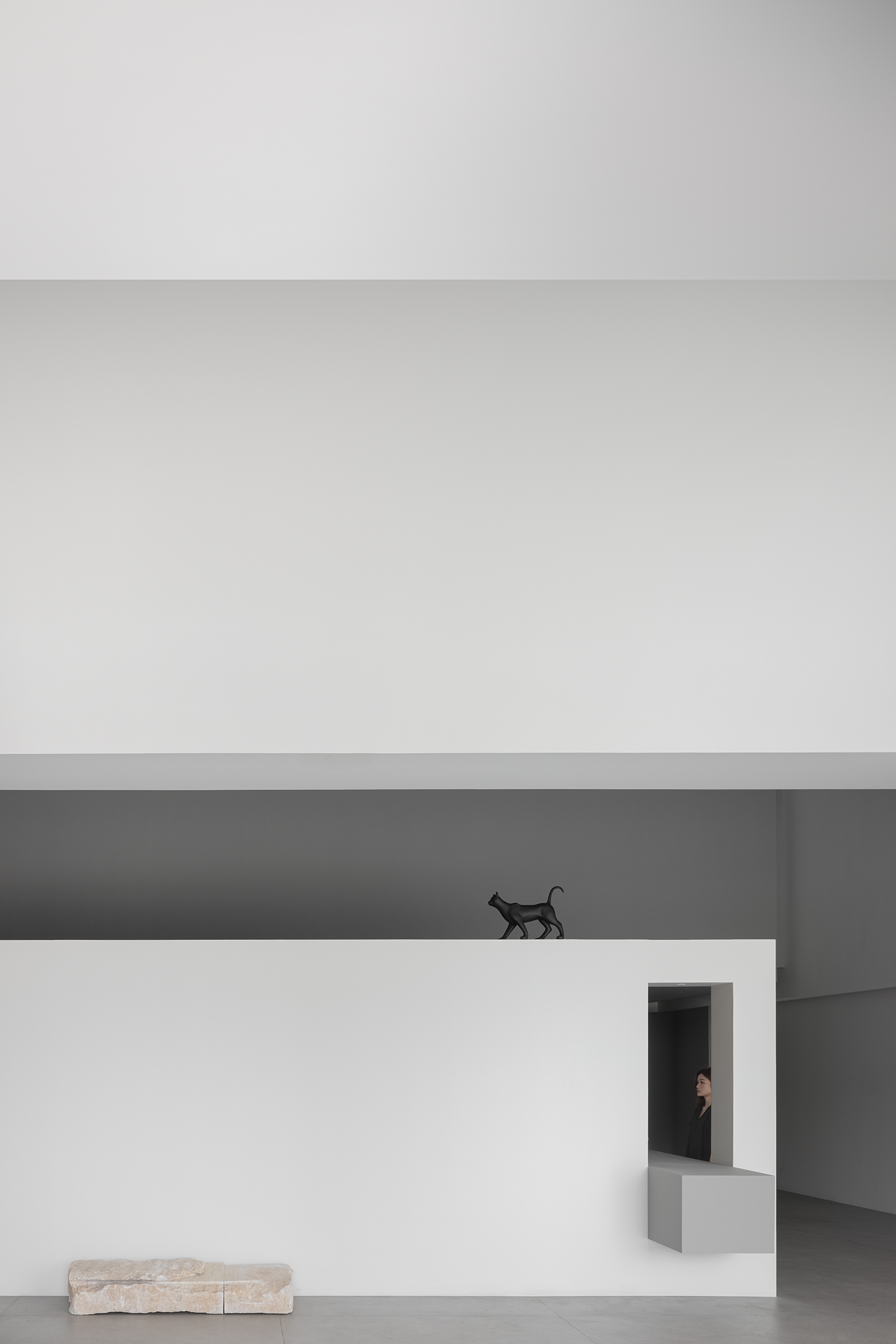
纯粹,恰是万物之美的基色。项目为本杰明涂料体验馆(Benjamin Moore),本案设计方【正向共合】,以大面积白调的无色之力,打造展馆建筑的极简结构。“故有之以为利,无之以为用”,《無色解构》的设计理念,即是有无相生。项目本身为涂料展厅,利用“无”的存在,更反衬“有”的色彩,利用冲击感的碰撞,调动对比感知,使纯净空间中的色彩,成为真正的焦点主角。 Purity is the foundation of all things. The project is the Benjamin Paint Experience Hall, designed by ZHANS, using a large area of white to create a minimalist architectural structure. "Therefore, what is useful is beneficial, and what is not is useful." The design concept of 《Colorless Deconstruction》, is the symbiosis of existence and non-existence. The project itself is a paint exhibition hall. It uses the existence of "nothing" to contrast the "existent" color, and uses contrast to make the color in the space become the real protagonist. 设计手法稳落于“极简主义,功能至上”的建筑思想之上,从门头到室内,每一处结构的形成,都相互关联,利用回环动线,与颜色的钥匙,解开空间的结构密码。 "Minimalism, function first", from the door to the interior, the formation of every structure is interrelated, using lines, and the key of color to unlock the structural code of the space. 强烈的视觉感,为访者塑造惊鸿一面的第一印象,由此开启展厅的体验之旅。极简线条与砖红大色块恰当配合,带动起纯色基调的灵动感,用设计的笔触,直白而艺术地诠释了展馆主题。 A strong sense of vision creates a deep first impression for visitors, thus starting the experience tour of the exhibition hall. The combination of minimalist lines and large brick red color blocks makes the space more lively. With the brushstrokes of design, the theme of the pavilion is bluntly and artistically interpreted. 简练的建筑语言,赋予展馆开阔明朗的格局。在几何构成的变化下,厅顶不是乏味的平面,曲度与直线交互,白色有了神采,空间有了韵律。同时用极简意形的物件补充空间,带入装点元素,使得疏朗的场域,兼具灵魂思想,而非流于表面的浮泛。 The concise architectural language gives the pavilion an open and clear pattern. Under the change of geometric composition, the roof of the hall is not a boring plane, the curvature interacts with the straight line, the white color has a spirit, and the space has a rhythm. At the same time, use objects to supplement the space and bring in decoration, so that the spacious space has soulful thoughts, not just blank space. 空与满相宜的建筑构成,具有通透的呼吸感,置身其中,心境旷达,随由每日时间的推移,投射着天然光影的舞蹈剧目。梁顶上黑猫摆件优雅神秘,将氛围凝结成一种迷人语境,吸引着访者进一步向内探索。 In a space with a sense of breathing, the mood is very cheerful. Sunshine performs different dances over time. The black cat ornaments on the roof are elegant and mysterious, making the atmosphere charming and attracting visitors to continue to visit. 高大的建筑,通常带有一种肃穆感,设计师在大门边的外墙下做了减法,恰当留空,使光源自然渡入,让空间获得独有的动态力量。在不同时间,不同程度的日影照耀下,建筑似乎有了创造力,自如地丰富本身的韵感,伴随着随机的效果创造,极简空间将发生无数次的偶然性浪漫。 Tall buildings usually have a sense of solemnity. The designer made a subtraction under the wall beside the gate to let the light source enter naturally and make the space dynamic. At different times and under different degrees of sunlight, the architecture seems to be creative, and the minimalist space has countless accidental romances. 隔墙将内外空间区分开,界限清晰,而又浑然一体,随着预设动线游览,即进入不同的功能分区。游走中感受秩序感,思潮与引线一起浮动,访者切身代入,与空间同频呼吸,收获独特的参观体验。 The partition wall separates the inner and outer spaces, with clear boundaries and a whole. Continue to explore and enter into different functional divisions. Feel the order, the ideas swim with the clues, the visitor and the space breathe together. 亚克力涂料色卡,序列有秩地展示于墙面之上,白幕背景墙,为访者与色彩的近距离对视,提供了纯粹的互动空间。展厅剥离硬性的商业功能,转而获得现代设计的艺术升华,塑成博物馆式的文化展列形态,即能够产生真正有共鸣的交流。 The acrylic paint color card is displayed on the wall in an orderly manner, and the white background wall allows visitors to interact with the color card at close range. Not a traditional commercial exhibition hall, but through artistic design, it becomes a museum-like cultural display that can really resonate. 隔墙上的长型空洞,成为内外部空间的一扇窗,隐隐约约层叠次落。灰色方形横直而出,与周围的白色产生对比,并丰富视觉上的立体度,石块布景未经雕琢,静置于灰板上,泻涌原生质感,自然生息在空间里轻轻流淌。 The space on the partition wall becomes a window for the interior and exterior spaces, with a sense of hierarchy. The grey squares sway sideways, contrasting with the surrounding white and enriching the visual three-dimensionality. Natural stone ornaments are placed on it, which is very natural and ecological. 从门头处的自然光影,到会客厅区域的模拟生态光线,体现不同场景功能的光学运用,将自然与现代力量恰到好处的融合,保留建筑的纯粹本真,以及现代化设计感。室内的家具陈设,选用不同的立体几何元素组构,让访者沉浸在几何空间的诗性美学里,创造灵气与匠心相和的艺术天地。 From the light and shadow at the door to the simulated ecological light in the living room area, it reflects the optical application of different scene functions. Integrate nature with modern design, preserve the nature of the building, as well as the sense of design. The interior furniture uses different combinations of three-dimensional geometric elements to immerse visitors in a poetic space and create an artistic world. 几何架构与纯白背景,拓宽了空间的尺度,取于自然的原石与超现实感金属球的融入,又将思维发散。投射于立圆镜面的迷离影像,折转虚幻,彼时,此刻,未来,交汇于此,显露设计艺术无限延展的生命力。 Geometric structure and pure white background make the space wider. The integration of natural stones and surreal metal balls spreads the imagination. The mirror reflection of the metal ball is very psychedelic. The past, the present, and the future all come together to demonstrate the infinite vitality of design art. 回环曲路的展厅动线,无形中引导访客自然流动到每个区域,不错过每一处的空间展列。后方场域为涂料墙展示,契合本项目主旨。随处可见几何线性设计,方与曲,正与柔,平面与立体,色彩与色彩,微妙地互相平衡,并产生印象深刻的戏剧演变。 The looped exhibition hall route guides visitors to each area invisibly, and does not miss the space exhibition in every place. The final space is the paint display wall, which fits the theme of this project. Geometric design can be seen everywhere, square and curve, regular and soft, plane and three-dimensional, color and color, balance each other, resulting in dramatic evolution. 顶部补光为空间主角而生,在建筑之力的作用下微微曲环内陷,宛若舞台追光灯,探照焦点,定格视线,纯粹意境里追逐色彩反应,余韵无穷。 The top fill light is born for the protagonist of the space. It is designed in a concave shape, just like a stage spotlight, chasing the focus color in the space. 建筑空间设计的材质,光影,结构,颜色,皆是设计师独有的语言词汇,以表达触动人心,完成与观者之间的精神领域对话。《無色结构》,停住这一刻,在无性色的广阔无垠中,心原上有缤彩跳动。 The material, light and shadow, structure and color of architectural space design are all the special language of the designer. Use expressions to move people's hearts and complete the spiritual dialogue with visitors. "Colorless Deconstruction", keep this moment, in the colorless expanse, there are colorful beatings on the heart.

展示空间设计 全球五强
获奖者:FED鱼眼设计
获奖作品:OCT华侨城城市展厅
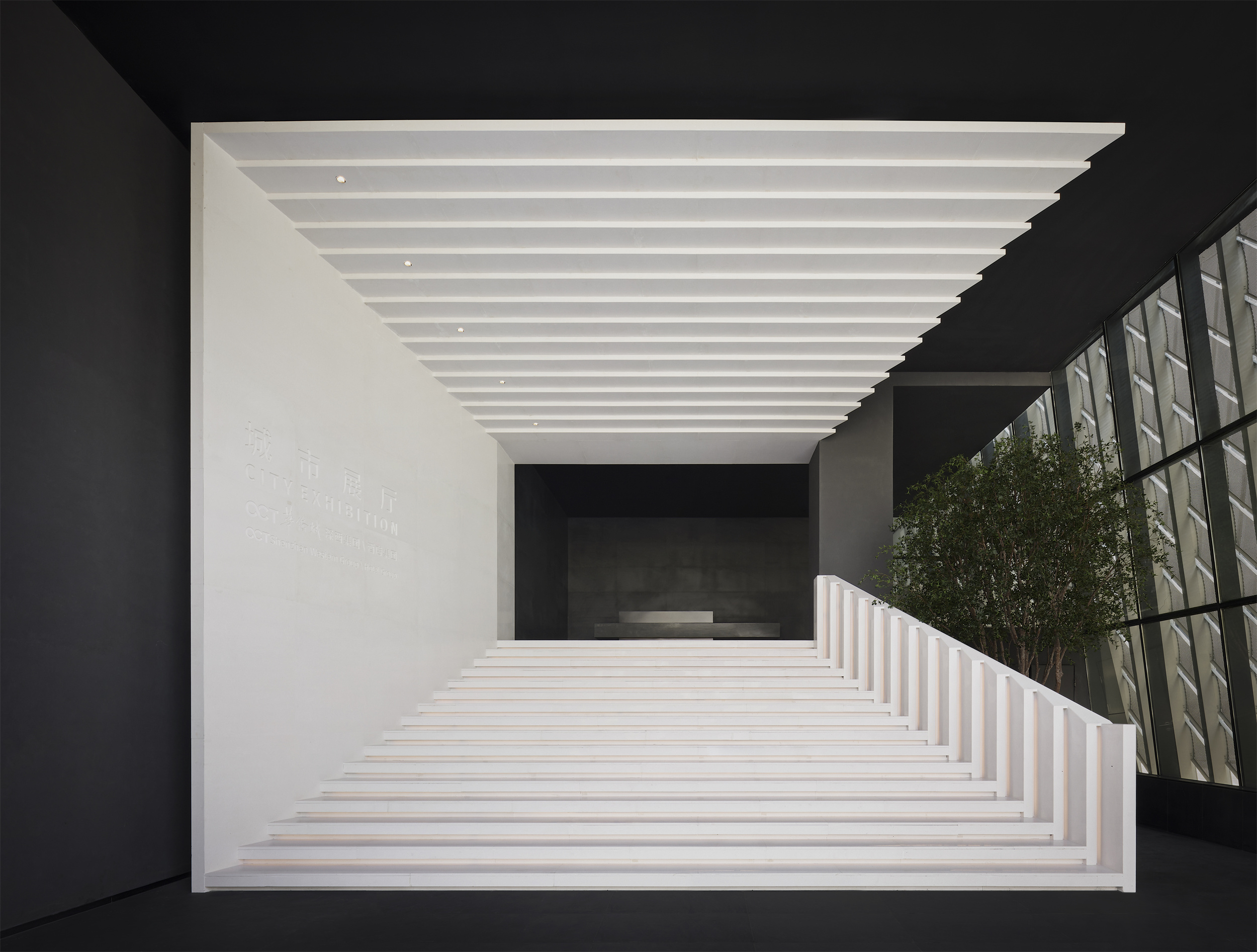
OCT华侨城城市展厅位于湾区核心位的深圳市前海宝安腹地,毗邻海滨,周边自然生态优美,是宜居的高品质之选。项目建筑本身是以“盒子”的几何形状呈现的,因此室内希望结合建筑的属性特征,利用多重几何手法创造一种层层递进的城市窗口关系,比如说开放式阶梯入口处,如同一个个叠起来的白色相框隧道,带客人进入城市的另一个时空间世界。白色连廊与自然光线的交相辉映,注重空间与自然环境的融合。室内运用漂浮的盒子,营造一种悬浮城市的感觉,与“城市展厅”的主题属性相呼应。木格不规则艺术装置墙增加了空间的灵动性和艺术美感。整个空间将自然与建筑、城市与几何艺术完美融合,塑造出梦幻而独特的空间体验。 展厅入口结合建筑本身的属性特征, 利用白色与几何图形对称性形成一种很强的视觉冲击。由层层递进的相框组合而成的楼梯,塑造了城市展厅简约而别具一格的开放式入口。传过前台拾级而上,是一条长窄的白色楼梯连廊,这个区域延续了入口的白色肌理,大量使用落窗和天窗,与自然光线交相辉映,使内部空间与外部自然环境融合得刚刚好。相反的,主室内的色调以深色系为主搭配暖色灯光,营造在城市夜景下享受宁静慢生活的氛围感。主室内展厅运用以漂浮盒子影射城市高楼的设计概念,将镂空立方体装置安装在天花板上,犹如一座座漂浮的建筑,构筑成悬浮城市的感觉。利用自然简约的建筑手法打造而成的不规则木格栏艺术装置墙,为空间塑造一种灵动的视觉效果。每一个洽谈区错落有致地布置在一个个悬浮盒子的交接处,自由舒适且极具艺术美感的时尚家私和艺术品摆放形式形成一个个独立的交流区,加上悬挂的绿植装置使空间更加自然随性,富有层次感。 该项目原建筑入口是从一个侧边楼梯进入的,因此过于狭窄隐蔽,无法体现出城市展厅的氛围感,因此设计师将原本入口形式进行调整,利用几何方框概念,将入口的空间在视觉上放大。进入后,有狭长的阶梯空间区域,空间利用不足无法很好的利用。因此,设计师将这一走廊区域规划为企业文化展示长廊,让参观的客人自然地穿过后到达主空间。由于原建筑设计的局限性,间有很多不规则形体的空间区域和架空的横梁,导致室内很难做出挑空大气的设计和创造有记忆点的空间关系。因此设计师利用横梁做了悬浮盒子装置空间,形成错落有致的空中城市概念,既隐藏了横梁的弊端,也让空间形成和谐的美感。 设计师结合建筑特色和“城市”的设计主题,利用几何图形去呈现室内与室外的关系,满足了空间流线需求,且具有让人印象深刻的视觉冲击力。设计师对原建筑的横梁等挑战因素给予了很好的设计反馈而不是单纯地去规避,利用悬浮盒子将这一弊端遮挡住的同时创造了错落有致的空中城市概念形态。为空间的塑造打破了传统售楼展示的装饰风格,更多地利用空间本身的结构创造了独一无二的设计亮点和美感。

展示空间设计 全球五强
获奖者:深圳市昊泽空间设计有限公司
获奖作品:成都温江 星河科创城雪山会客厅
空间的赞美诗 设计阐述|韩松 人到中年,对设计上曾经的某些坚持,对设计语言、构建、功能上的执着开始变得越来越模糊不清了,但是却对能够解决建筑空间原始问题的能力和方法论却涌现出越来越笃定的信心和极大的热情。 所以当我为了写这篇设计说明而被迫不得不重新审视自己的时候,我给自己确立了几个设计原则: 一、 空间一定是有生命的 就像人的生命感的被感知是因为外在的呼吸、心跳、血液流淌,更在于行为、意识、思考和情感,于人而言就有丑与美这样的意义感。那于空间而言呢?那必然是光,她就是空间的血液、空间的呼吸、空间的思考和空间的情绪,上帝说:要有光!空间就活了。 二、人在空间中是美的 空间因为有人的存在才有意义,我回首过往以现在的标准来评判做了太多设计的恶,人在空间中极奇丑陋,也谈不上人因空间而得的喜悦感,更谈不不上因空间而感叹人生的思考性和诗意。 做为万物之灵的人,在空间这个载体的烘托下,他的一举一动都应该是神圣而美的。 三、空间是宽容的 空间从它诞生之时起其底层意义就是为人类遮风避雨的安全庇护所,所以它具有天然的如母亲子宫般的包容性,并衍生出种种其他门类及艺术等。 不知何时起,为达成语言,构建目的的空间设计变得越来越苛刻,谨小慎微地执行着每一个预设性步骤。 因为有人说"上帝在细节里",我不这么认为,我越来越相信宏大的主旨是不需要华丽的语言来为其增色的,它有强大的容错性,它的力量感不需要细细碎碎的精致来支撑,这需要强大的乐观,也许犯错会产生意想不到的效果,所以我现在经常会说:一切都是最好的安排。 具体到这次的项目设计上,这是一个集产业、商业、办公、住宅、酒店等产城一体的双营销体验中心,未来要兼具市政性城市展厅,社区化政府便民服务中心,城市公园社区艺术中心等可持续性功能,所以宏大的设计愿景和对未来感的想象空间,与设计个性的理性控制之间的微妙平衡,成为贯穿整个设计过程的核心要义。 整个建筑仿佛被发掘出来的钻石,又似乎振翅欲飞的羽翼,璀璨而轻盈,到了室内空间,我们做的所有努力都是用严谨的逻辑将功能区块化,精准排布位置,然后随着建筑的势,应物适形。 你斜插入天,我半嵌入地;你折叠翻转,我翻转折叠。 第一、建筑和室内空间融为一体,没有丝毫的设计违和感和痕迹感; 第二、将所有能与光互动的空间让渡出来,成为公共的、开放的、与人互动的有生命的空间,(我们可以清楚地看到展厅上面像云彩一样剧烈翻滚的空间能量,这种光线跟随着时间的脚步,每时每刻都在变化,它就如时间一样短暂。&mdash&mdash 斯蒂芬·霍尔),我想我们做到了。 当我在佛罗伦萨的乌菲齐美术馆看到艺术家阿纳尔多·波莫多罗的球形雕塑,被40年前对未来的想像深深地震憾,我们将它置于直线条的空间中,有一种超越现实的对话感。 我们在连接产业板块和住宅板块的长廊上空做了一个大型艺术装置《极光》,灵感来自于刘慈欣的短篇小说《梦之海》,低温艺术家以宇宙的尺度来创造艺术。我们用一片一片的亚克力创造了一个现实版的物化的、飘渺的、波光鳞鳞的、充满神秘感的极光,寓意终极之美。 最后我还是引用斯蒂芬·霍尔的一句话作为结语:建筑的功能是通过构建发光的空间能量来激发灵感,它最大的用途就是深深的感动我们。

展示空间设计 全球五强
获奖者:罗伟
获奖作品:写在湖面上的诗
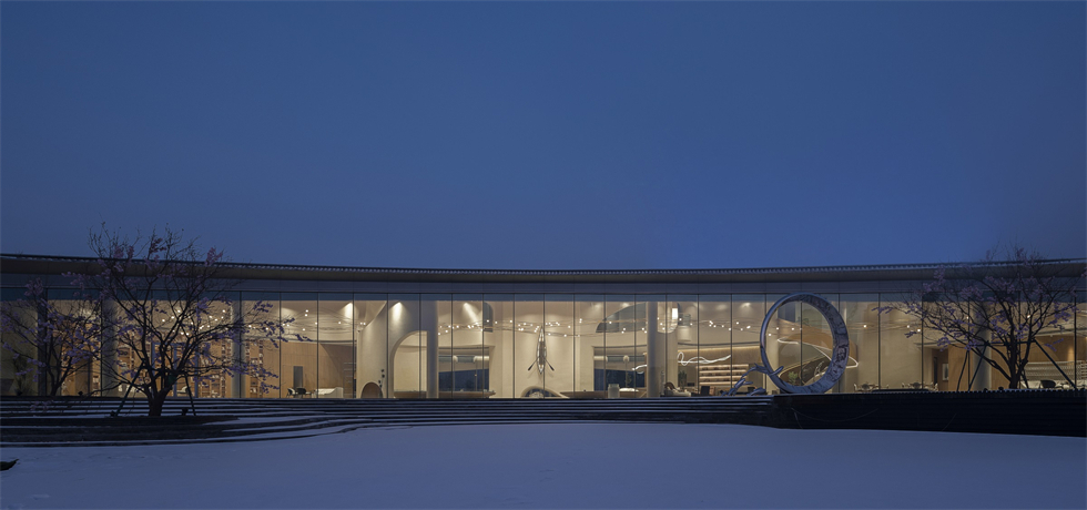
哈尔滨城际之边,阿什河蜿蜒汇入松花江。明月日渐丰盈,弯月定格轮廓,简而又飘逸的月牙形建筑体,面向无垠城市,因冰雪底色而纯粹至美。 On the urban fringe of Harbin, the Ashi River winds its way into the Songhua River. The bright moons is getting full day by day and a crescent silhouette is fixed; From the appearance, the simple and ethereal crescent-shaped building faces the boundless city, creating a pure and beautiful ambiance on the background color of ice and snow. 建筑如弯月庇护下的玻璃晶体,通透如明月沁入人心,建设者希望打造一处面向社区的艺术地标,对于设计师而言,更愿意把这座湖心的售楼处定义为艺术馆,哈尔滨人在寻常生活中对美的追求,是设计对一方水土自然秉性的致意。 Like crystal glass under the shelter of the crescent moon, the building is as transparent as the bright moon that refreshes the mind. The builders hope to create a community-oriented artistic landmark. The designers are more inclined to define the sales office in the middle of the lake as an art museum. The aesthetic pursuit of the Harbin people in ordinary life is reflected in the design as greetings to the natural characteristics of the local conditions and customs. 透过室内建筑体验空间、光影、材质、细节,提供对人的情感关怀,回归真实的需要,是本案深度思考和解决的难题。设计师在尊重建筑形式和客观环境的条件下,将现代工艺的精巧细致和写意的审美兼并,缔造沉浸式的艺术空间对话情境。 The difficult issue to think thoroughly and solve in this case is to provide emotional care for people and return to authentic needs through the experience space of the interior of the building, light and shadow, material texture and details. The designer, on the premise of respecting the architectural form and the objective environment, has combined the exquisite modern technique and the aesthetics of freehand brushwork to create an immersive dialogue situation in artistic space. 由新月萦绕的浪漫叙事展开。月亮是一种隐喻,月相随时间而变,建筑弧度也似经历了明月的时光流转,起伏中获得了极佳的城市景观体验,自然与城市,室内与室外的边界被淡化消弭。 A romantic narrative lingering around the new moon unfolds. The moon is a metaphor, and it changes along with time. The radian of the building also seems to have gone through the passage of time with the moon, and the fluctuations offer an excellent experience of urban landscape, in which the boundaries between nature and city, between indoor and outdoor areas fade out or even disappear. 从前厅进入是顷刻降临的喜悦与震撼,直通天花的弧形墙面上,几只鱼造型艺术装置在电子影像投射的水波牵动下, 似跳跃而起, 颠倒视觉的同时,让参观者不由地静静感知艺术带来的抽离感,鱼水相生,幻梦照进现实。石上清泉、月影相映、鱼戏浅水、涟漪层层,营造充满活力的自由艺术空间。 Walking in through the front hall, you’ll immediately feel the joy and the shock. On the arc wall leading right up to the ceiling, a few fish-like art installations seem to be leaping forward under the influence of the water waves projected by electronic images. While reversing the visual effect, it also enables visitors to spontaneously gain a quiet sense of detachment brought about by art. Fish and water exist together, and fancy dreams may come into the reality. Crystal spring flows on stones, the moon looks at the shadows on the earth, fishes play in shallow water, and ripples appear in layers, all of which make a free art space full of vitality. 本案最大的难点是,月牙的建筑形体,内部柱体支撑比较多。从整体性出发,柱体与线面的融合,墙、顶、地的自由流动让空间具有极佳的穿透性。一道道弯月的韵律,带着诗性的力量,在空间中舒展,营造流动的艺术感。 The most difficult point of this case is that the building body in the shape of the crescent moon needs more supporting columns inside. Speaking on the whole, the integration of columns and the line and plane, and the free flow of the wall, ceiling and floor have granted excellent penetrability to the space. The rhythm of a succession of crescent moons spreads in space with poetic power, creating a flowing sense of art. 接待处与水吧连接成曲线,如蜿蜒的湖岸串连起的滩崖。鱼跃湖面的元素幻化为暖色木的鳞片形态背景墙,以细腻的手法丰富了墙面的设计。 The reception desk and the water bar are connected into a curve, as if beach scarps along the winding lake shore. The element of fish leaping on the lake being transformed into the warm-toned wood background wall of scale patterns constitutes an enrichment of the design of the wall through exquisite techniques. 设计师说“哈尔滨是一座非常寒冷的城市,希望人们在这里可以探索和交流,从艺术中获得快乐和治愈的力量” “Harbin is a very cold city, and I hope that people can explore and communicate here, and obtain happiness and healing power from art,” said the designer. 因地域环境的关系,室内天花选用暖色木,在冰冷的雪季里,无论映衬雪景、水景、月色下,都能传递温暖的感觉 面对湖的落地窗前毫无阻挡,无论日出还是黄昏,光无时无刻都雕刻着一种难得的静美。白天阳光透过玻璃融入室内;夜晚华灯初上,是另一翻通透明亮。墙面则用香槟色的艺术涂料来强化这一简单而颇有质感的光环境。 Due to the regional environment, warm-toned wood is selected for the indoor ceiling, which can convey warming feeling in the ice-cold snow season, against all background sceneries such as the snow, water and the moonlight. The French window facing the lake boasts of an open view, and enjoys a rare serene beauty carved by the light both at sunrise and at dusk. During daytime, sunlight penetrates into the room through glass; at night when the lights are on, it shows another style of transparent brightness. The walls are decorated with champagne-colored artistic paint to highlight this simple but much textured light environment. 在沙盘区,几笔弧线将柱子包容为体块,结构从而消隐为无形;飘带形灯饰从洞口穿过,贯穿到各个功能区;当人们从湖对面望过来,便可看到由诗意所搭建的“艺术之城”所要传达的内在精神。 In the sand table area, a few arcs are enough to encompass the columns into a block, by which the structure disappears into invisibility; ribbon-shaped lighting passes through the hole and reaches each functional area; when people look across the lake, they can understand the inner spirit to be conveyed by the “art city” constructed with poetic flavour. 冬日,一座月牙形建筑从湖心升起,从中心最高处挑起10米的高度,又在两端垂下,似从雪中生长出来,引人进入内部的诗意空间。洽谈区就在这垂悬下来的两侧对称分布,坐看湖面,冬天是凝固的美丽,冰面上人们飞旋而过,滑出道道优美的弧线;夏日,叠水石的园林景致和小舞台则生发出无尽的美好。 On winter days, a crescent-shaped building rises from the middle of the lake; on the highest point in the center there is an elevation of ten meters with the two sides hanging down, as if growing out of the snow, inviting people to enter the poetic space inside. The negotiation space is distributed symmetrically on the two sides of the overhanging area; sitting here for a view of the lake, you can enjoy the frozen beauty of winter; on the ice, people slide by very fast, leaving beautiful arc stretches behind; in summer, the delightful garden scene of the cascading water stones and the small stage give out endless enjoyment to human heart. 在冰城之畔,这种自然的庇护感,给人安慰、包容和温暖,正所谓“此心安处是吾家”。因这湖水、皓月、游鱼而生的空间不断流动、演变,缔造出自由而温暖的艺术之境。这正是设计师一直坚持的,“以建筑对人情感的关怀和回应作为设计出发点,做有温度的建筑,守护有温度的城市。 On the fringe of the ice city, this natural sense of shelter is an offer of comfort, tolerance and warmth, and the so-called “My home is where my mind is at peace”. The space created by the lake, the bright moon and the swimming fish is in a constant flow and transformation, forming an artistic environment of freedom and warmth. And this is what the designer has been sticking to, “Take the concern and response of architecture to human emotions as the starting point, make buildings full of humanistic care and safeguard a friendly city”.


