 打开微信扫一扫
复制链接

商业空间设计 全球五强
获奖者:普悦设计(深圳)有限公司
获奖作品:tea'stone万象前海店
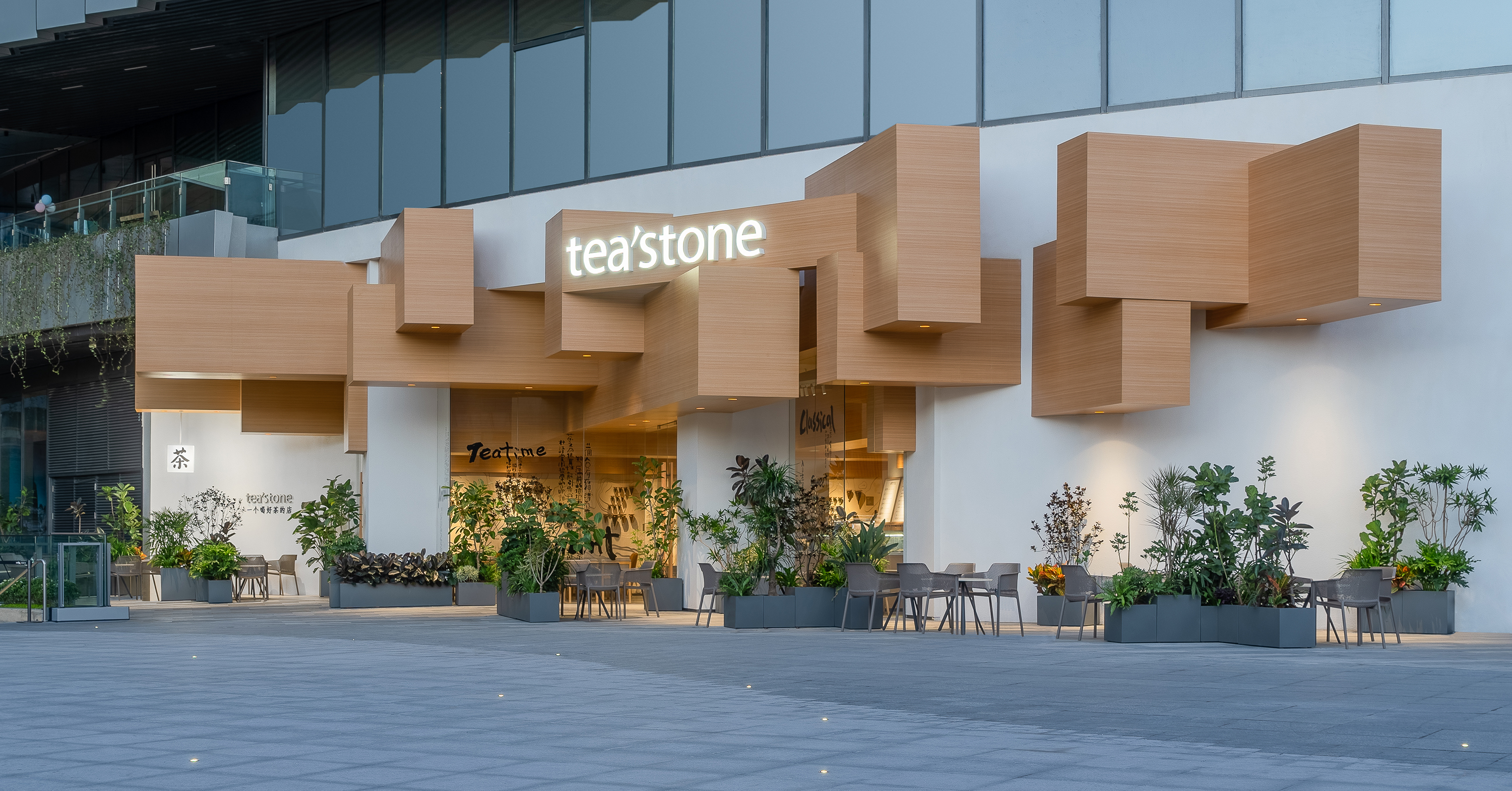
tea'stone前海万象店选址于深圳前海首个大型购物中心,依托场所商业氛围、tea'stone品牌精神与设计创新相结合打造本案,在开业之初就成为整个商场最热门的打卡点之一。 The tea'stone Qianhai Mixc store is located in the first large shopping center in Qianhai, Shenzhen. Relying on the commercial atmosphere of the place, combining tea'stone brand spirit and design innovation to create this project. The store has become one of the most attractive stores of the whole shopping mall since its opening. 本店以‘轻博物馆’概念为项目设计定位,以中国茶源远流长的产地文化为精神内核。从最早诞生古茶的秦汉,选取标志性建筑元素“殿堂梁柱”为设计原点,采用当代的设计语言的表现方式,营造一种轻时尚、年轻化的茶生活美学空间。既是向古典建筑形态的致敬,也呼应品牌方作为中国当代原创茶饮品牌的企业定位。 This store with the concept of "light museum" as the design orientation of this project, taking the traditional origin culture of Chinese tea as the spiritual core. From the Qin and Han Dynasties, where ancient tea was first born, the symbolic architectural element "palace beams and columns" is selected as the design origin. However, the expression mode of modern design language is adopted to create a light, fashionable and young contemporary tea life aesthetic space. This is not only a tribute to the classical architectural form, but also echoes the client's positioning as a contemporary Chinese original tea brand. 店铺位于商场一层最东侧的入口广场位置,外立面及入口形象的设计为本案的重点。左侧上方的挑台对门店形象招展区有一定侵入,原建筑外立面为弧形幕墙结构设计,与品牌气质不符。为解决这些问题,设计师以现代手法表现秦汉梁柱,榫卯结构融入其中,让梁由室内空间“生长”出外立面,组成有线条关系的体块感,纵横交错后又产生有规律的整体感,从广场远远望去会有一种超现实的未来意境。形成tea'stone 独有的场域精神和“茶香绕梁”的古今对话。 The store is located at the entrance square on the eastern side of the first floor of the shopping mall. The design of the facade and entrance image is the focus of this project. The cantilevered platform on the upper left side intrudes into the store image exhibition area to a certain extent. The external facade of the original building is designed as an arc-shaped curtain wall structure, which is inconsistent with the brand temperament. In order to solve these problems, the designers used contemporary techniques to express the Qin and Han Dynasties' beams and columns. The mortise and tenon structure was integrated into them, so that the beams "grew" out of the facade from the indoor space, forming a sense of block with line relations. After crisscrossing, there will be a regular sense of wholeness. Looking from the square, there will be a surreal future artistic conception. Form the unique spirit of tea'stone and the ancient and modern dialogue of "tea aroma around the beam". 客区立面以白色为主基调,天花纵横分布着木梁结构。营造出轻松的且带有茶感的空间体验,无论与朋友畅谈、或独享悠闲时光。 The facade of the public area is mainly white, and the ceiling is vertically and horizontally distributed with wooden beam structure. Create a relaxed space experience with tea aroma, so that people can talk with friends or enjoy leisure time alone in the space. 吧台仍然是空间的重心,山形摆件形成独特的吧台景观,与对面“茶色大地”装置墙形成整体,集合中国茶山人文地理、茶样及风土样本,品牌方用装置艺术化的语言表达出当代中国 茶的博大精深。 The bar counter is always the center of the space. The mountain shaped installation gives people deep impression. And forms an integral whole with the opposite "Tea Map" installation wall, and shows the collections of Chinese tea mountains culture geography, tea samples and soil samples. Expressing the broad and profound nature of contemporary Chinese tea with the installation of artistic language. 环境保护是本案设计的基本原则之一。我们在设计的选材上更多的采用可循环使用的非天然材料,本案大量运用了木纹铝板,降低对木材的砍伐。我们希望从自己做起,通过设计把环境保护与商业有机结合,提供一种新零售空间可持续设计的可能性。 Environmental protection is one of the basic principles of the design of this project. We use more recycled non natural materials in our design. In this project, a large number of wood grain aluminum plates are used to reduce the cutting of wood. We hope to start from ourselves, organically combine environmental protection and commerce through design, and provide the possibility of sustainable design of a new commercial retail space.

商业空间设计 全球五强
获奖者:Benoy Limited
获奖作品:David Jones Elizabeth Street Flagship Store
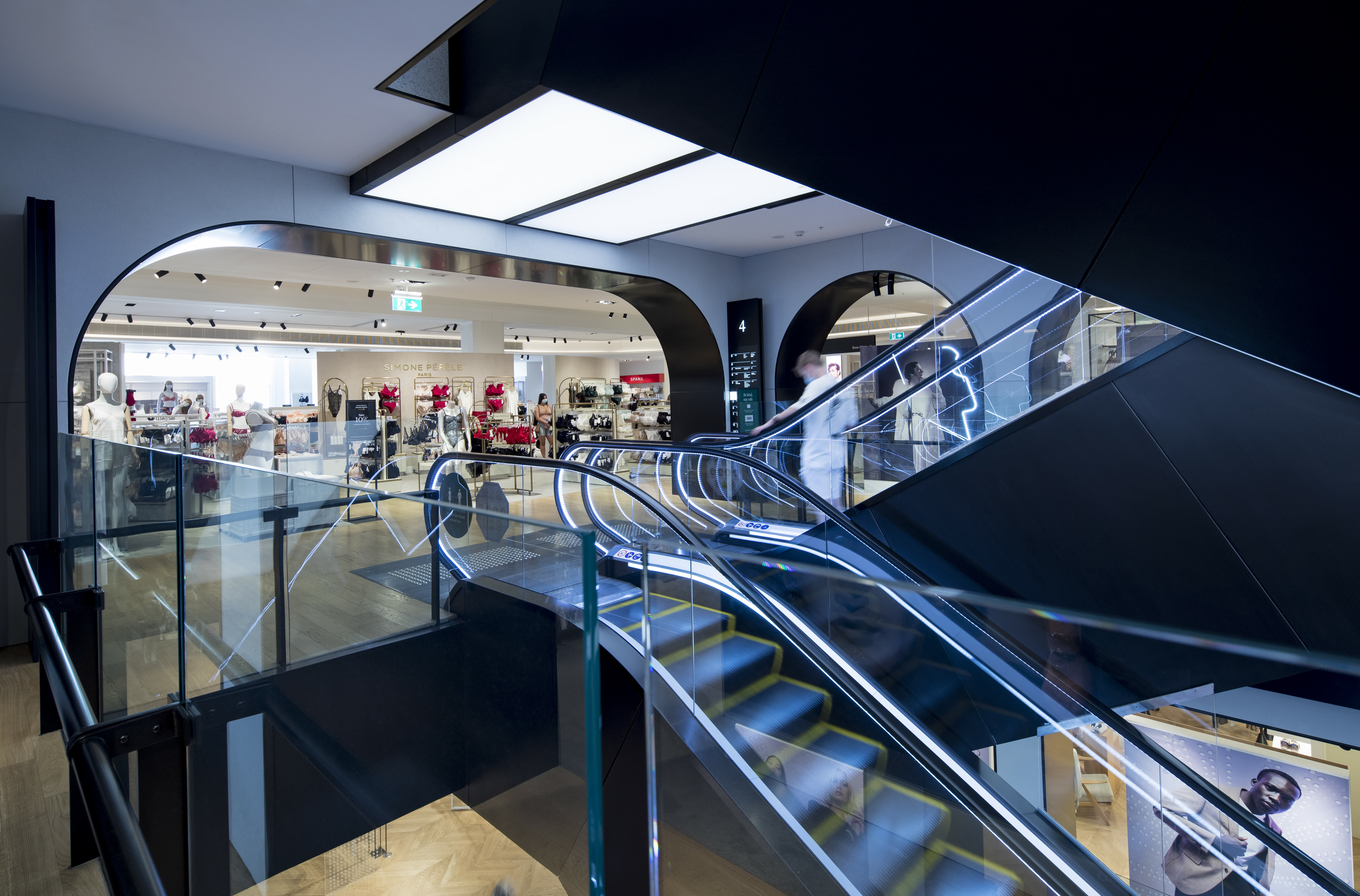
David Jones in Sydney’s Hyde Park District is one of Australia’s leading and most iconic department stores. Housed in an elegant, Inter-war Stripped Classical Style building with close to a century of history and heritage, David Jones has been at the forefront of Australia’s immersive and experiential luxury retail environment since 1927. Benoy takes what is unique and exciting about David Jones and the department store at large and rejuvenates this for contemporary patrons, reinventing the “grand old dame of luxury retail” to appeal to the contemporary experience-led consumer, providing it a firm foothold in the 21st century and beyond. Rejuvenating the interior and exterior, we blended the existing building fabric with the redesigned interior layout. We utilized the store’s 12 levels, optimizing the space to create a more diverse retail offering. In particular, we carefully examined how its original shading and dimensions were used to reflect certain moods and special occasions, such as how the beveled-edge portal frames of the shop fronts in the Glamour Hall reflect the use of chamfered corners in the building’s original design. The main interior concept is ‘Windows to the World’, where each level was designed as a portal to transport customers into a new world of David Jones. It includes five distinct ‘worlds’, each one with distinct interior architecture qualities and specific target audiences. These include The Agora (homeware goods and food hall), Glamour Hall (beauty and accessories), The Terraces (women’s fashion), The Salon (men’s fashion) and The Verandah (luxury shoes and bridal). With an area of 32,000 m2, we utilized ‘conceptual layering’ rather than typical ‘floors’ to create different experiential zones. This was achieved through new escalator atriums and forecourts which also enabled enhanced commercial circulation throughout. Now clad in sleek black metal with underside panel lighting, the newly refurbished escalators are the consistent element which highlight the verticality of the atrium, much like a ribbon swirling upwards or downwards. We added a contrasting element to the escalator voids to better accentuate the space, giving a feeling of exclusivity and optimises and consolidates all 12 floors of the interior space. The Verandah’s shoe displays use polished brass and marble tops for a classy, elegant and exquisite feel. As a nod to the building’s former life as an art gallery, we integrated this narrative by designing loose table displays to showcase the brands’ shoe collections, which also provides flexibility for visual merchandise arrangements. We delved into, and took influence from, David Jones’ rich 100-year old heritage. The resulting design strategy involved a series of delicate and thoughtful architectural and interior modifications, which strengthened the relationship of the building with its current urban context and create a distinct and well-curated contemporary experience through its interiors. We preserved the original herringbone timber flooring design and introduced a darker tone to the floors to create contrast between the walls and ceilings. We preserved the old timber material in strategic areas throughout the store to retain original elements which hark back to David Jones’ rich and prestigious history. To enhance and showcase the original ceiling treatment of the heritage building, minimal lighting was used which also ensured a clean layout and sophisticated look. Black frames with white panel lighting were installed in the beauty section, which visually showcases the brands in a more prominent and uniformed way.

商业空间设计 全球五强
获奖者:罗全崧
获奖作品:成都天府壹号名车旗舰店——天使来客
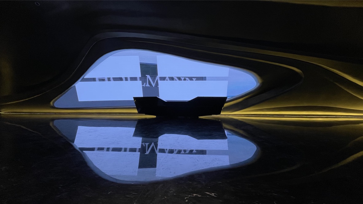
项目简介 项目名称:天府壹号超豪汽车展厅 地理位置:位于四川成都绿地之窗 用途:主要用于莱斯劳斯、宾利等超级豪车展厅 面积:1800平方 功能分区:一层汽车展厅;二层会所及接待 材料: GRG、金属漆、大理石 设计师:罗全崧(广东光影色空装饰设计工程有限公司) 设计理念 展厅大堂从立面到天花采用一体流动优美弧形,打破传统一进大厅就看到二楼过道的单一表现形式;整体流动弧形让长长通道消失在展厅中,从而让整个展示面更完整。 整个大厅主立面的灵感来源于莱斯劳斯标志,天使的翅膀;用主体造型塑造出优美的翅膀动线,同时沿用于整个主立面;大厅正中央超级大的LDE大屏幕造型犹如一只上帝之眼,透过光芒为展厅增添千万缤纷色彩;演绎出豪车激情与尊贵; 深色大理石地面与LED屏幕的倒影显现另一只隐形的翅膀,在虚实之间幻影幻现;犹如在梦幻与理想中起飞。在大厅中央看到二层两边凸显的空间犹如两个飞碟悬浮在空中,演绎出科幻感,更给天府壹号展厅增添了一份神秘感;黑色大理石造型前台像一个经过精心雕琢的钻石飞船从上帝之眼中划过,犹如天外来客般震撼。而水滴形状的收银台仿佛穿越在星际银河隧道中滴落的星光,整个设计如上演了一场星际穿越的大片。

商业空间设计 全球五强
获奖者:泛域设计
获奖作品:IINC白色广场
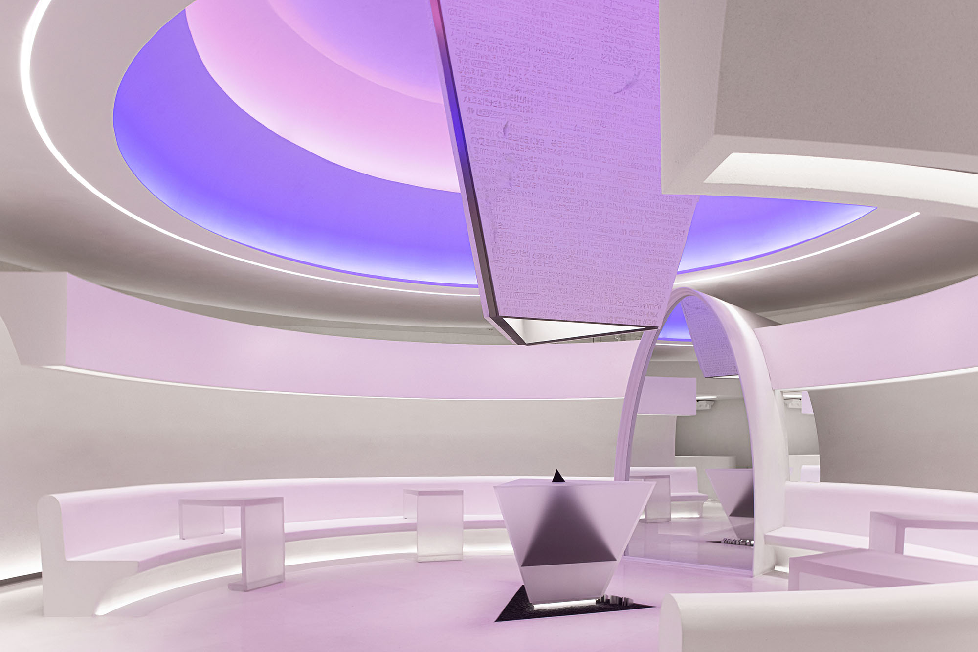
2007年成立的IINC是一家集合了国内外300多个独立设计师品牌的大型时尚买手店。经过10多年的发展, 已经成⻓为拥有百万粉丝和线上线下联合发展的大型综合性先锋买手店。 “ I 自我 · Independent 独立 · New全新 · Confident 自信 ”审视自我并赋予自我全新的面貌,享受独特独立的个体的自性感。 以诠释IINC的品牌精神的态度去设计品牌售卖空间,是一件有趣有意义的事情,让这份截然不同留存。 城市的是由居住其中的居民所创造的,这就导致了每一座城市因为居住者、地理、气候等不同的因素而不同,品牌的构造者就是城市的创造者,他们提供了一个独特的城市空间,邀请全世界各地的游客来此观赏、游玩或是定居。 关于一座城市由“纪念性建筑、广场、住宅、景观”组成,关于广场,是其中最具开放性与包容性的空间,是人们从各个方向的聚焦点与发散点,在广场里的人们展示着自己的审美品味。 商贩,游客,艺术家,表演者等等在广场上发生着不重复的故事,千人千面的广场与IINC买手店的内在基因喊出了相应的口号。 发声,聚合,纪念性,神秘感,仪式感,空间雕塑,是空间设计的关键词,它们构成了这个“白色广场”,它有关于IINC的独特气质。 这个白色的空间应该是与任何被定义或者不被定义的风格都是无疏离感的,用纯白的空间接纳不同文化,不同的人群,不同的服装,成为开放式的互动平台。 可以广场中心发声,展示独特的个体思维;可以在这边聚合,去寻找相似的灵魂。被赋予广场属性以后空间变得更多元可变。 白色广场散落着雕塑、纪念碑或喷泉,这是一种纪念性的表达方式,也是一种精神性的传递关系,“白色广场”以广场的形式,逐层设计了中央雕塑、开放空间、环形展示区、外围的展示柜,即广场与广场周围建筑的对望关系。 透过主入口的门洞,可穿透玻璃依次看见每个空间层次,还有广场最具标志性的中央雕塑,人流从入口处,即被引导分散进入不同的区域。探索型的引导方式成为在广场上制造浪漫与惊喜邂逅的可能性。 围合在最外的是广场周围的街区,也是挑选与购买的地方,一侧为贯穿的服装陈列区域,另一侧则是多功能的展示层板。 如从中心走道贯入,便会经过弧形的长廊,到达广场的中心区域,这里也是展示与活动的区域。 纯白的空间更像是一副画布,服装是艺术品被陈列展示着,白色广场承载活动的可能,比如新品发布会,走秀,品牌vip活动等,灯光具有强烈的演艺性质,空间开始慢慢的呼吸,慢慢的进入色彩的世界。 此时的白色广场瞬间变得妩媚,动人,预示着事件即将发生,让人们进入后的体验更为丰富。 雕塑是空间中的艺术,也承载了空间的灵魂。广场是一种历史悠久的存在,而它也在时刻获得新的存在意义,空间中的雕塑在表达保留文化属性同时创新自我的态度。 广场的中心,是一个倒置的三角锥装置,它被切割为三份,逐层掉落,尖端在触地的瞬间回弹,穿插而上。 上半部分的石碑,每个面分别刻着古埃及象形文、古希腊文、埃及草书,来自于《罗塞塔石碑》的文字对埃及考古界来说,让此前无法破解的古埃及象形文有了突破,而石碑本身也被赋予“翻译多国语言”、“关键线索”等意义。与现代英语最为相近的古希腊文中,IINC的logo文字被隐藏其中。 下半部分的展示台,是现代极简的表现手法,白色与黑色的相互透叠,就像贝聿铭在巴黎打造的玻璃金字塔,现代的金字塔是为活人所建,表达尊重。 空间留给创作者的惊喜,有时会成为一个特别的存在。项目开始时空间拆除后,裸露的管子,有趣的手法在于将它包裹了浪漫而具有装饰性的古希腊柯林斯柱头,并用古典雕塑在博物馆里陈列的手法呈现。 这是一种故事的未预知性和思考与解决方案的产物。 欧式线条被比例放大后营造出了一种陌生的熟悉感,也被延伸至收银区、更衣室。希望它是不规则的,突破固有形态的,厚重而又轻盈地浮在空间里,功能性与装饰性在易被忽略的角落贯穿起来。海格力斯之柱是力量的象征,把阿特拉斯山脉一分为二,破镜而出的手臂,支撑住倾斜的柱子,镜像与现实,组成了完整的一组画面。繁复与极简,自然与力量,冲突与对比无疑是强烈的,墙面的莨草与花鸟的浮雕,承载柔性的力量。角落的椅子则是由罗马斗兽场的形态变化而来,斗兽场的存在原是用云观看角斗士的比赛,但在中世纪前期,逐渐变为住宅、工作坊、圣职人员宿舍、防御工事、采石场以及宗教圣地等用途。如同空间的广场概念,浓缩在这件黑色的家具上。 现代广场的用途意义变得更为广泛,除了政治与宗教外,它更多的是去呈现多样性,每个角落发生的故事都可能是一本寓言书籍,我们在此设立了一个“水池”,期许、愿望被投入其中,仪式化的行为让事件的层次变得更加丰富。 色彩被光赋予了生命与情感,白色的空间本是无机的,在光的环绕下呈现截然不同的气质。模拟日出与日落广场的形态、感受紫色的神秘、橙色的活力、粉色的甜美。 光影的变化成为白色广场独特的主旋律,弥漫的色彩让整个空间瞬间拥有相同的气质,却随时可变。 时尚潮玩,艺术设计,前沿跨界,品牌的发声即是品牌的表达,空间雕塑是表达的手段,神秘感与仪式感是表达的感受,而最终到每个个体的纪念性是个性表达的存档。


