 打开微信扫一扫
复制链接

公共建筑设计 全球五强
获奖者:Brooks + Scarpa
获奖作品:Metalsa Center for Manufacturing Innovation
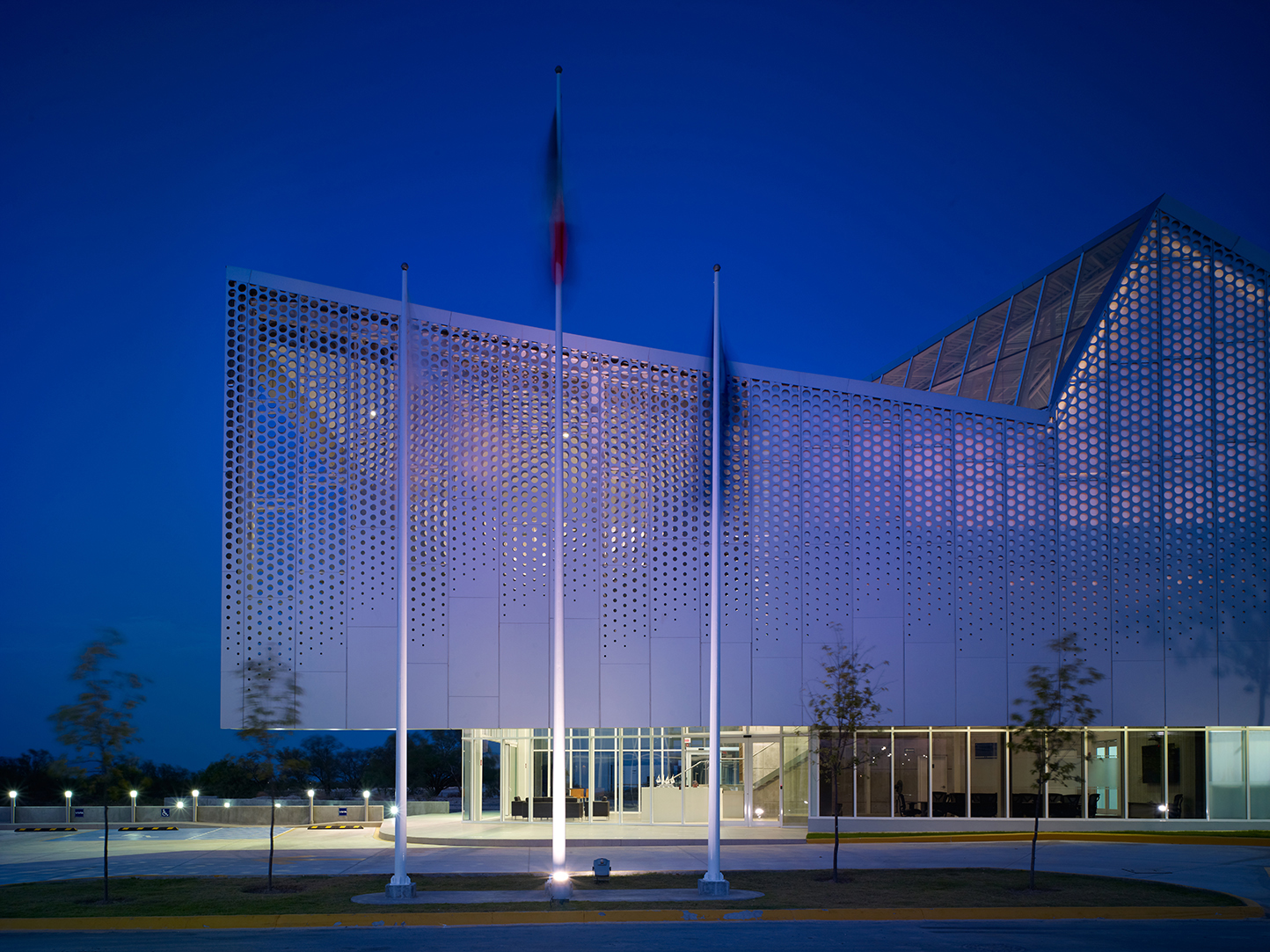
Metalsa SA began as a family-owned company, founded by Guillermo Zambrano Gutierrez in 1956 that manufactures chassis and structural body components worldwide for a variety of heavy trucks and pickups in facilities located in the USA, China, Japan and India. Today the company has manufacturing facilities located around the world and boasts several major automotive corporations as their clients, including Ford and Toyota. Site: Located in Mexico’s Research Park for Technical Innovation (PIIT), a science and technology park, which is a partnership between government, universities and the private sector to seek economic growth through technical innovation. The 1000 hectare campus is host to more than 50 research centers devoted to R&D as well as the development of technology innovation in nanotechnology, biotechnology, mechatronics and advanced manufacturing, information technology, clean energy and advanced materials development. Program: Master Planning for a 5,000 square meter research lab, office and industrial testing facility serving an automotive industry client who designs and manufactures automotive and heavy truck chassis. The first phase encompasses a total of 15,500 square feet, including 5,500 square feet of office space and 11,000 square feet of research labs and warehouse space for testing and developing prototypes. The second phase consists of an additional 5,500 square feet of office space and 34,000 square feet of research labs and warehouse space. Solution: Industrial buildings of this type are rarely a model for workplace innovation. They are typically a direct, and often nefarious programmatic response to the function inside with little consideration for the occupants needs. The approach to this project was to preserve the integrity of a high bay industrial facility and program, while providing a model environment for the users and visitors. A saw-toothed roof draws from the geometry of old factories and the surrounding Monterrey Mountains. The angled elements of the roof provide abundant natural daylight to the spaces below at the building’s northernmost elevations. By modulating space and light thru a fractured roof geometry, the building is able to maintain a rational plan to meet the rigorous requirements of the program, while providing a strong connection to the landscape both visually and metaphorically.The second major feature of the building is the perforated metal skin that clads the entire façade. The custom aluminum skin is both perforated and etched. It incorporates interplay of solid and void, orchestrating areas of both light and shadow, while limiting views into the research areas, necessary to protect proprietary trade secrets. Thus, the industrial program has been transformed from a black box environment to a light filled space with a strong visual connection to the outside. Each of these strategies and materials, exploit the potential for performance and sensibility while achieving a rich and interesting sensory and aesthetic experience. Programmatically, the building is divided into two volumes – warehouse/labs and offices functions. The upper story of the offices cantilever over the lower story to the west and is clad in a highly perforated metal skin and is the main entry facade. The lower story is mainly glazed and open to reveal portions of the research laboratory, machine room and other industrial functions not requiring visually security. From the exterior, the warehouse appears to float lightly over the mechanical and intellectual heart of the program, reversing the notion that an industrial building should be solid and protected. Rather, the building seems very open and is intended to feel vulnerable revealing parts of its inner program to public view. The main entry of the building is located at the northwest corner under the cantilevered volume. It is flanked by a sunken garden to the north, which is overlooked by the surrounding offices. The garden connects to the adjacent water reclamation wetland for the entire PITT campus. A large operable door located off the entry in the main public space opens to the garden outside.

公共建筑设计 全球五强
获奖者:Provencher_Roy & Yelle Maillé architects consortium
获奖作品:Hôpital du Sacré-Cœur-de-Montréal Expansion
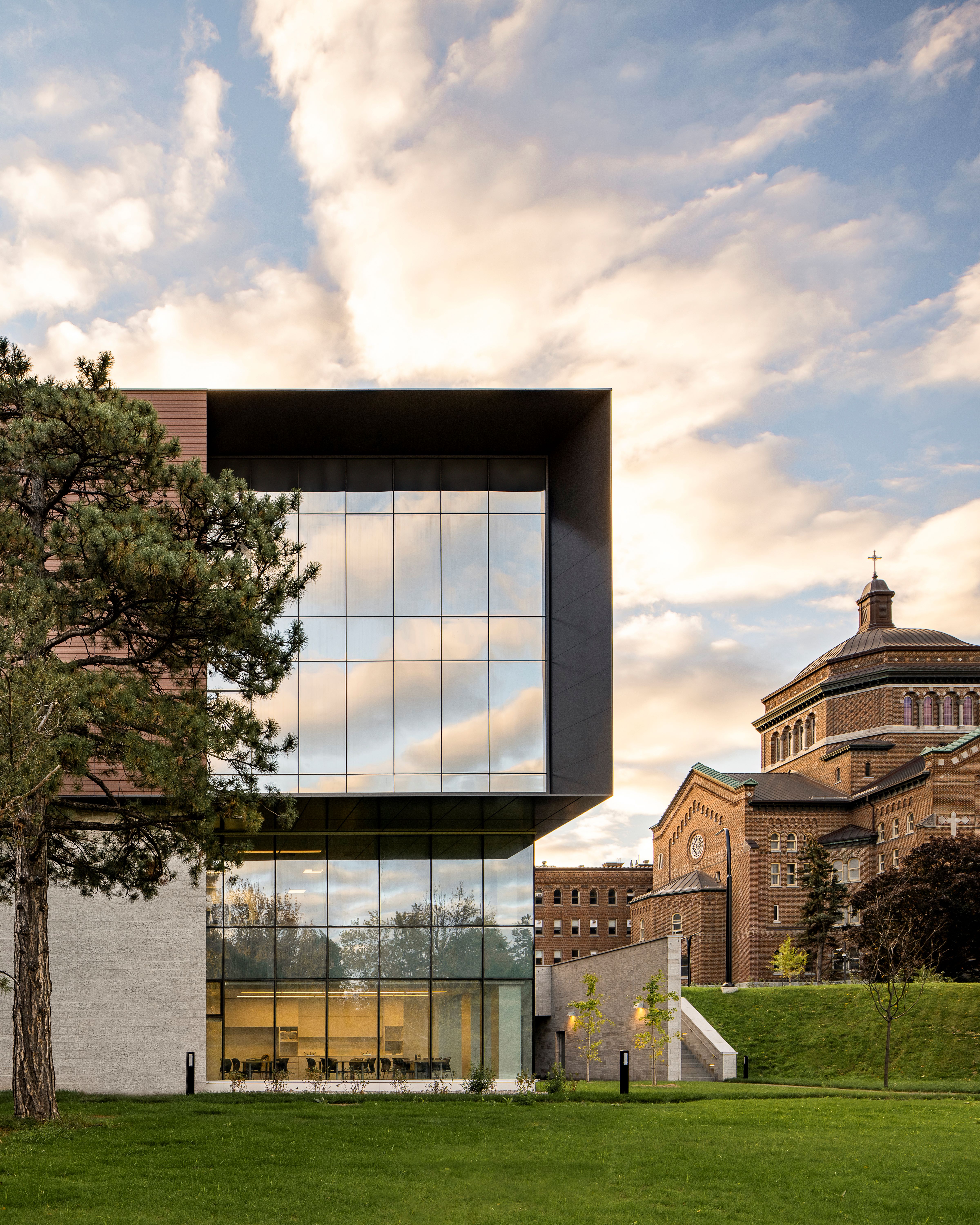
The architectural intent of the team is supported by the vision to create an innovative and contemporary health care facility that is anchored in and complements the historic hospital campus. Affiliated with the Université de Montréal, the Hôpital du Sacré-Cœur de Montréal (HSCM) is one of the largest ultra-specialized trauma centres in Quebec. The 6 story L-shaped expansion spans 16,252 m⊃2;. The new volume comes to rest above the existing emergency department, which was kept in operation throughout construction. The project features an integrated trauma centre, an endoscopy unit, mother-child and obstetrical units, a medical device reprocessing unit (MDRU), as well as research laboratories and teaching facilities. The Integrated Design Process (IDP) team ensured that the needs of all stakeholders were met throughout the design process. The shared common goal, to deliver a state-of-the-art building in harmony with its surroundings and based on a set of sustainable strategies (LEED and WELL), informed the design decisions. Maximizing views towards the sprawling bucolic site, referencing the historic building’s materiality as well as taking advantage of access to natural light, are the project’s primary aims. The well-being of both patients and caregivers was at the heart of the design team’s priorities. In addition to providing functional spaces, where staff insight was gathered through the fabrication of full-scale mockups, the design harnessed the therapeutic benefits of natural light at every occasion. This was inspired by the history of the institution—HSCM was initially specialized in the care of patients with tuberculosis, for whom access to fresh air and sunlight were essential for healing. In order to give the extension plenty of daylight, the corridors and public spaces open onto windows and all patient rooms have floor to ceiling windows as well. This makes for welcoming and calming healing environments where outdoor views of nature contribute to improved patient outcomes and increased staff satisfaction. In order to preserve the original layout of the imposing building, the designers took great care to insert the extension in continuity with the existing plan, thus respecting the initial scheme. This preservation effort ensures that the circulation paths fit harmoniously into the overall plan; an intangible fragment of the place's heritage is thus assured. Moreover, this organization results in an optimized wayfinding strategy. At each end, every main interior pathway opens up to the outdoors, making these rather functional spaces luminous and more user-friendly. To further facilitate the wayfinding of users and to highlight the identity of the site, on each level, the public paths and elevators open up to the former chapel. Thus, as they move around, visitors are constantly in touch with the natural site and the chapel, the institution's symbolic landmark. The addition’s sobriety contrasts with the central chapel, the contemporary addition is refined, a tribute to rather than in competition with history. The abundance of glazing frames and reflects views of the surrounding architecture, providing a sense of place and continuity for the users. The façade’s treatment with alternating vertical bands of glass and porcelain stoneware echoes the original hospital façade. The colour of the exterior mimics the red/brown brickwork of the surrounding buildings. Planning had to be as efficient as possible while offering a welcoming atmosphere. For example, the endoscopy service was thought out according to the patient care pathway: reception, preparation, intervention, and collection follow one another in a clear and simple way for the clientele. We should also mention that the succession of services from one floor to another was also studied in-depth. Thus, the sequence was established to prioritize optimal connexions between the complementary services and maintain safety, security, and efficiency. The interiors are characterized by warm, calming materials like wood while accommodating the hygiene and sanitization requirements required in the hospital setting. New gardens allow patients, visitors, and staff to enjoy spaces for quiet contemplation and rest as well as boost exposure to natural light. The upper levels of the new volume contain patient rooms, the curtain wall is broken up into vertical bands by terracotta-colored porcelain stoneware cladding. The plan creates a feeling of rhythm across the facade while also echoing the brick exterior of the historic hospital's facade. The choice of materials is in line with the durability and sustainability requirements for the building. The porcelain stoneware panels are suspended from an aluminium sub-support structure, providing masonry installation durability without the additional weight. In fact, the volume appears to float above the glazed lower levels, where patients in waiting rooms and cafés enjoy sweeping views of the grounds and the historic architecture. The designers bet on an overall appearance of simplicity. Thanks to this strategy, the new wing is part of a vision of sustainable development for the campus—which facilitates the integration of future expansions—while ensuring the architectural and cultural durability of the original historical building.

公共建筑设计 全球五强
获奖者:MAA - MELIKE ALTINISIK ARCHITECTS
获奖作品:CAMLICA TOWER
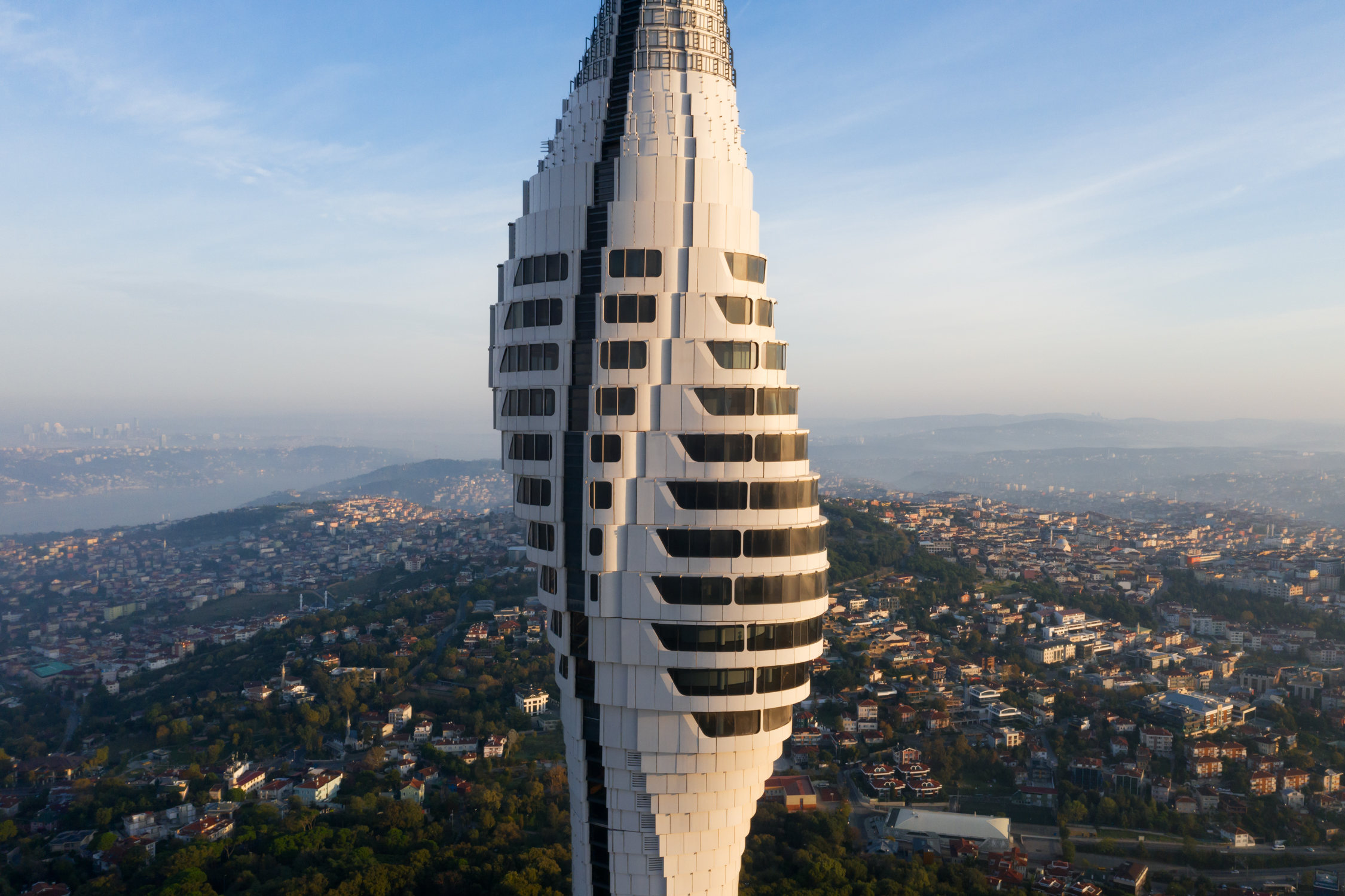
Istanbul’s futuristic 369m meter-tall new telecommunication tower seeks a sense of motion and rhythm within its silhouette that changes when viewed from different directions around Istanbul. Çamlıca Tower is not a line or a trace, but an expression of history, culture, communication, and interaction. Moreover, it is a sociological aspect of the silhouette and statement of the city to its citizen in line with its needs. It is the reflection of its nature. Tower has an organic structure that is not familiar within the urban fabric of Istanbul. The main design inputs such as wind direction, local topography, and the sceneries reflected in the form of the tower. Its architectural formations combine elegance and beauty with math and geometry, whose innovative concept allows inhabitable spaces to be attached to the whole of the tower’s core. In this unique tower which requires advanced engineering techniques both in terms of architectural design and construction methodology, all the design features, architectural planning and material selections were made considering these processes. While wind testing was employed to confirm the monumental structure’s overall stability, it was also used to develop the unique facade design and optimize how the load of the building envelope would act on the concrete core. The engineered facade not only provides structural optimization but allows for inhabitable space to radiate around the tower’s central concrete core. A Building that Turns into a Space of Dialogue and Exploration: The telecommunication tower will house two-story 360 view restaurant and observation deck overlooking views of Istanbul, from Asia to Europe. There is also a public foyer, café, exhibition and mediatic areas inside the entrance podium. Interior design was developed based on the fact that the building includes unique spaces that offer a new experience and contain futuristic design characters. The main purpose is to create surprising encounters by establishing strong relationships with where it is located, using light, nature, and spatial spaces; so that it may change people’s perspective, and courage them think differently. The new landmark structure completed its construction process and has started its main telecommunication functions in November 2020. Çamlıca Tower opened its doors to public use in May 2021 and since then it is welcoming the visitors from all over the world.

公共建筑设计 全球五强
获奖者:Keiichiro Sako
获奖作品:CRYSTAL in Jinan
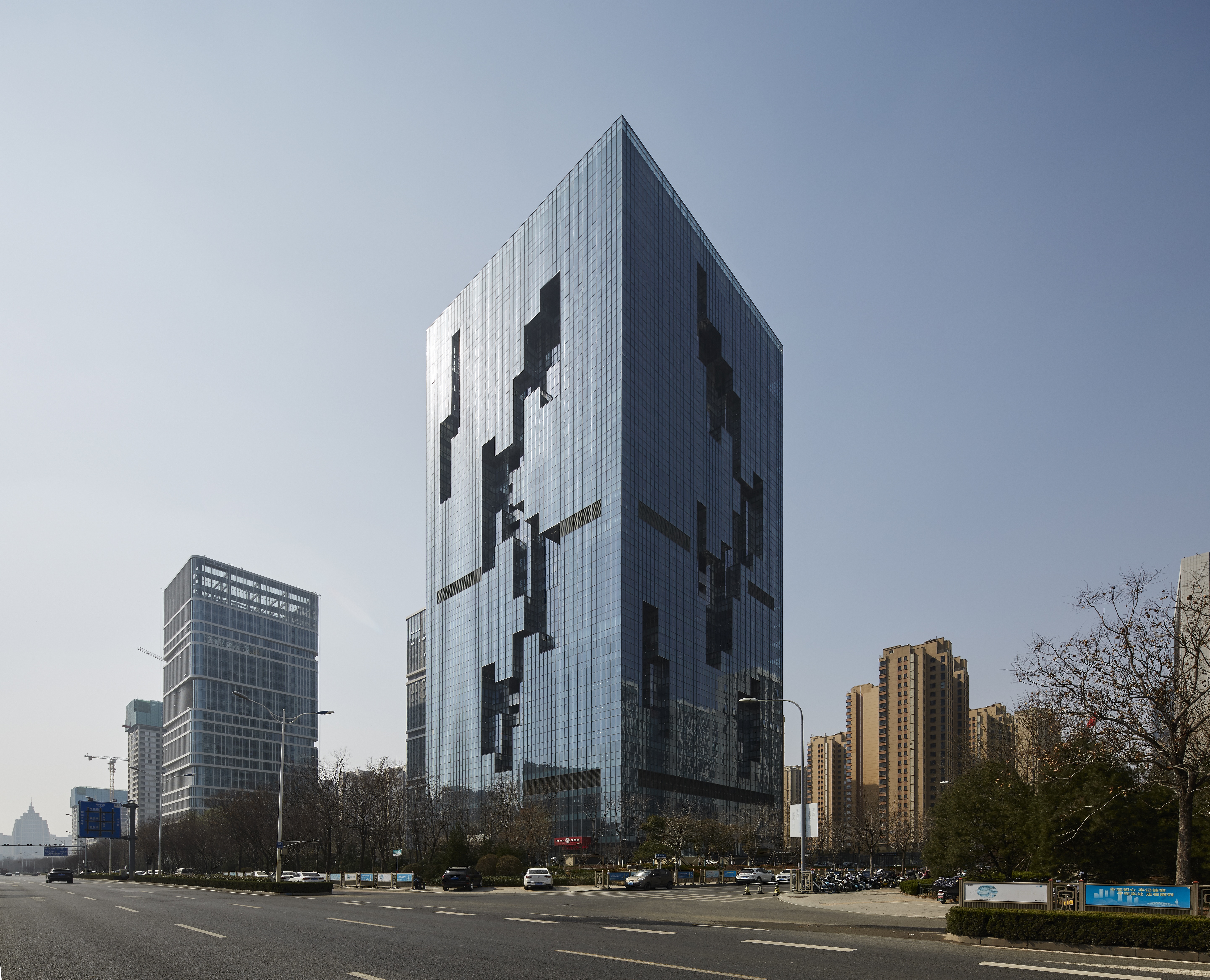
The 29-story office building with a maximum height of 126 m is located in the development zone around the new high-speed railroad station. 500% floor area ratio and economic rationality have led to the adoption of twin towers in the surrounding areas with the same conditions. The 54.4 m square plan is the square root of 3,000 m2, which is a critical measure for area zoning. This large square plane encompasses a 27m square atrium, which is vertically stacked from ground level with two, five, six, five, six, and two tiers of atriums. The first two-level atrium is the entrance hall and retail atrium. The atrium above it is the common office space, with elevator banks located at the four corners of the atrium providing individual access to each. The office space surrounding the atrium is planned in such a way that a single company may occupy it exclusively or many companies may share it. An atrium located in the center of a building can feel claustrophobic due to the lack of natural light. In order to create an open atrium, we designed a "crack" in the exterior wall through which direct light shines into the atrium. In order to allow the reflected light to reach as far as possible into the atrium, the atrium is a minimalist white space. For the curtain walls on the north, south, east, and west elevations, the mullions were designed to be as inconspicuous as possible. The building area is 3000m2 and the building height is 126m. In other words, this lump of glass has a volume of 380,000 cubic meters. The ``cracks'' on each side, north, south, east, and west, create the effect of making this volume look like a glass crystal. The ``crack'' brings daylight into the atrium, and at the same time is used as a private terrace for the offices facing it, as well as a common terrace connected to the atrium. At night, it transforms into an illusionary figure. The horizontal bands of light that reveal the stacked atrium and the vertical light that reveals the "cracks" gradually change to blue and purple, creating a futuristic impression like that of a science fiction world. Locals call this undulating "cracks" "like a rising dragon.


