 打开微信扫一扫
复制链接

住宅建筑设计 全球五强
获奖者:Arshia Mahmoodi
获奖作品:RO54
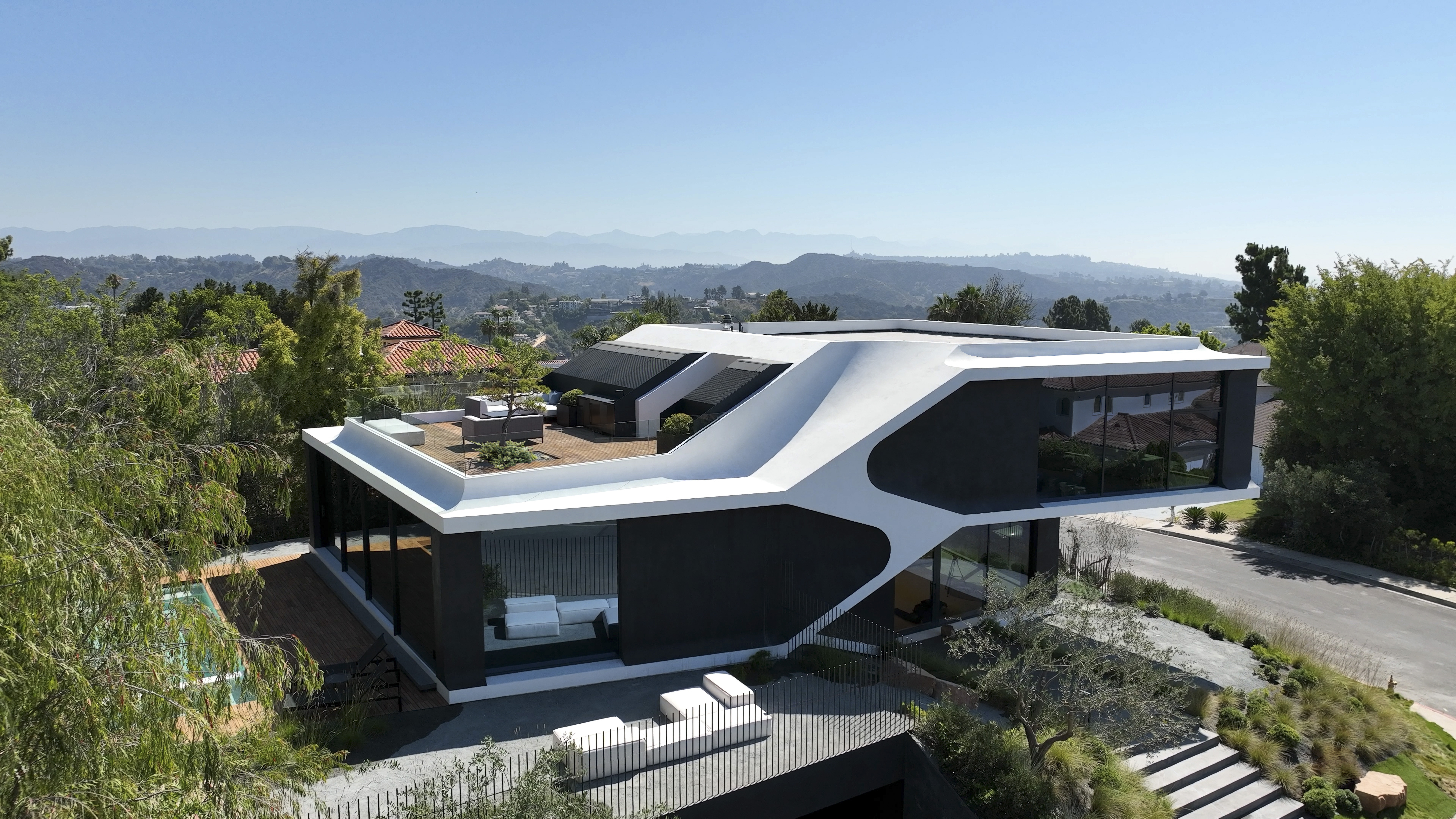
Perched on a hilltop in the Bel Air neighborhood of Los Angeles, overlooking the Pacific Ocean and the Los Angeles basin, the project gently lands a dynamic building on top of a buried podium that replicates the natural topography that was once there before the area was subdivided for development. This hollow post-war neighborhood has been transforming gradually, overtaken by recent developments that rely on size rather than spatial quality. The concept set out to reduce the massing of a rather large project, for it to lodge within the neighborhood proportionally. It proposes an alternative model within the confines of stringent regulations. This project engages an exercise in spatial relationships to accelerate the programs of the house. It utilizes the split-level design to follow this topography of the hill and to connect the floor half-story plates. The plates form adjacencies, both visual and functional therefore allowing twice the utility of an otherwise compartmentalized organization. The project’s aesthetic was directed by streamline automotive design, which among others, proposed concealed performance for every technology in the house. The interior palette was based on a utilitarian approach to materials, in contrast to the overall ambient approach of the design where space overcame necessity. This balance of power proceeded in the backdrop of environmental sensitivity and clinical dearth. A courtyard created by daylighting the lower bedrooms from the buried podium, also acts as the rainwater runoff filtration system for the entire site. The project meets or exceeds stringent California green building and energy conservation standards such as low-flow plumbing systems, drought tolerant planting, rainwater filtration, photovoltaic integration, high efficiency building envelope and glazing, HERS rating of the mechanical system and more. Indoor materials specified were sourced naturally and compliant with Low VOC standards. Design palette was kept minimal to an all natural selection such as mica plaster, hardwood flooring, natural stone. The project sought out minimal, low-impact, and proven materials, achieving a balance between durability, ease of maintenance and responsible design. The project has so far won 18 international design awards including: A Design Award 2023 ACDA - Architecture, Construction & Design Awards-2022 AMP - Architecture Masterprize-2022 Architect of the Year Awards-2022 Best Of Year_ Interior Design Magazine-2022 Built Design Awards-2022 Credaward-2023 Global Future Design Awards-2022 IDA - I Design Awards-2022-Ro54 LABC - Los Angeles Architectural Awards-2022 LIT - Lighting Design Awards-2022 LIV Hospitality Design Awards London International Creative Competition-2022 LOOP Design Awards-2022 Outstanding Property Award London-2022 SIT-Interior Design of The Year-Professional Titan Property Awards-2022 UDAD-Urban Design & Architecture Design Awards-2022

住宅建筑设计 全球五强
获奖者:Rogelio Vallejo Bores
获奖作品:The hill in front of the glen
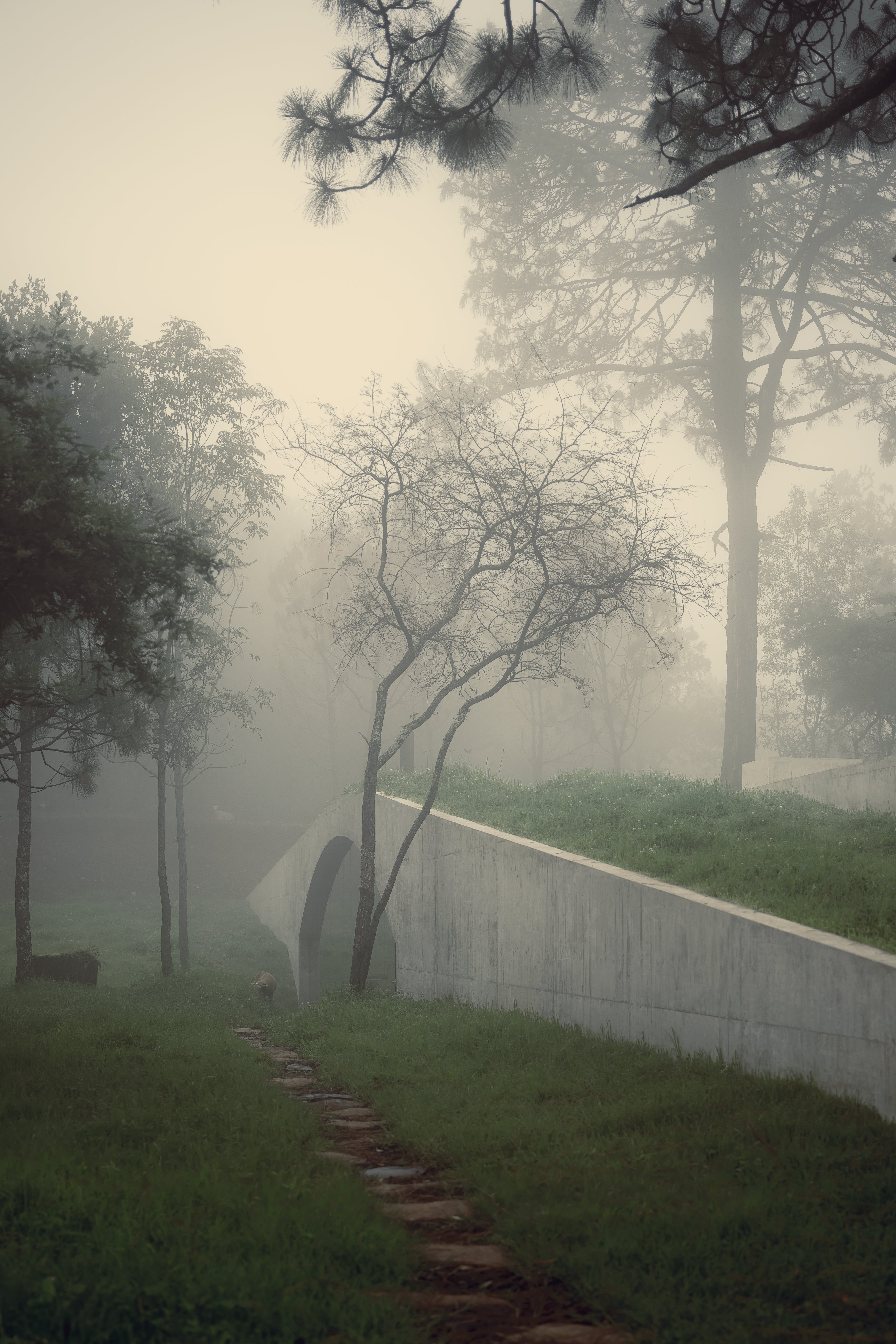
THE HILL IN FRON OF THE GLEN The idea that originated this project came from the subtle murmurs whispered by an environment like this, which were carefully listened to, and from the client's search for protection and shelter. How can one feel protected? and in any case, what can be done when feeling vulnerable? This question was accompanied by an image or perhaps a memory: that of a frightened child covering himself with a light bed sheet as he looks out to make sure he sees what is going on around him. Pulling a bed sheet to cover up is a very elemental act that alludes to the most basic part of the self; a bed sheet hides, protects, wraps, and creates a space underneath so safe and intimate that it is able to keep away any spirit, ghost, or demon that may be surrounding the room. At the same time, it generates a continuity in the beautiful living surface around the land, forming a new hill in a place already surrounded by many of them. Architecture should be in this case an accent mark on the words of a poem, a comma, or in any case a question mark, but it should never be the poem itself. The poem is already given by the pines, the oaks, the sweet acacia, the fireflies, the road, the fence, the neighbor's water well, the earth, the orchard, and the nightingale. Such accents marks in the poem were four concrete walls that emerged surprisingly from the landscape; two of them bear the land of this new hill that appeared by raising the bed sheet, and two others frame the drive to escort guests on their way into the house. This path is wide enough to walk it comfortably alone but too narrow to do it accompanied. Visitors are cast into a solitary pilgrimage that leads to an old tree with such a significant presence that it was necessary to distort the linearity of one of the walls with a gentle curve to make it possible to pass next to it...so close that it is even possible to graze it as we walk by. After crossing the tree threshold, going down a few solid pearled stone steps, and opening a heavy steel door, a concrete vault stands there. It supports the loads of the green bed sheet that rests on it and gives a sensation of being inside a cold, dark, but strangely cozy cave. Concrete was chosen as the main material because of a dream of this new rock melting while inevitably interacting with the forest, changing colors... grays that turned to greens, blacks and yellows that were gradually incorporated into the environment. The flooring would emphasize the aroma of wood perceived when you are surrounded by pine trees, giving balance to the cold temperature of the concrete. Finally, steel took place because, with time and rainfall, it acquires the look of tree bark. As for the spatial organization, the public areas are completely exposed to the wooded ravine on the left side of the house; the private areas on the right side open more timidly to a courtyard that allows to see the sky and the top of some trees but shuts down a bit from the outside. It was important to have the least possible references to elements that would connect to a specific moment in time, so the refrigerator and appliances were hidden, the lighting was arranged very discreetly, and only the four main materials were included: stone, wood, concrete, and steel. It was very important for the client to preserve the rough and primitive atmosphere of the mountains. (Chinese) 峡谷前面的小山 引发这个项目的想法来自于这样环境所发出的微妙的杂音,我们仔细聆听了 这些杂音,也来自于客户对保护和庇护的寻求。 在任何情况下,当一个人感到脆弱时,可以做些什么? 这个问题伴随着一个图像或也许是一个记忆:一个受惊的孩子用轻薄的床单 遮住自己,他向外看, 以确保他看到周围发生的事情。 拉着床单遮盖是非常基本的行为,暗指自我最基本的部分;床单隐藏、保护 、包裹,在下面创造出安全和亲密的空间,能够阻挡可能在房间周围的任何 精神、幽灵或恶魔。 同时,它在土地周围的美丽生活表面产生了连续性,在一个已经被许多小山 包围的地方形成了一个新的小山。 在这种情况下,建筑应该是一首诗词上的重音符号,一个逗号,或者在任何 情况下,是个问号,但它绝不应该是诗词本身。 诗已经被松树、橡树、甜刺槐、萤火虫、道路、篱笆、邻居的水井、大地、 果园和夜莺所赋予。 诗中这样的重音符号是四面混凝土墙,它们出人意料地从风景中出现;其中 两面承担着这个通过掀开床单而出现的新山的土地,另外两面则框住了车道 ,在客人进屋的路上护送他们。 这条路足够宽,可以独自舒适地行走,但太窄了,无法做到陪伴。 游客们被投进了一条孤独的朝圣之路,通往一棵老树,这棵树的存在感如此 之强,以至于有必要用柔和的曲线来扭曲其中一面墙的线性,使之有可能从 它旁边通过............. 如此之近,甚至有可能在我们 走过时放牧它。 穿过树的门槛,走过几个坚实的珍珠石台阶,打开一扇厚重的钢门,一个混 凝土拱顶矗立在那里。 它支撑着搁置在上面的绿色床单的负荷,给人一种身处寒冷、黑暗但奇怪的 舒适洞穴内的感觉。 选择混凝土作为主要材料,是因为梦想着这种新的岩石在融化的同时不可避 免地与森林互动,改变颜色............. 灰色变成绿色,黑色和黄色,逐渐融入 环境。 地板将强调当你被松树包围时感受到的木头的香气,给混凝土的低温以平衡 。 最后,出现了钢材,因为随着时间和雨水的流逝,它获得了树皮的外观。 至于空间组织,公共区域完全暴露在房子左侧的森林峡谷中;右侧的私人区 域更胆小地开放到庭院, 可以看到天空和部分树木的顶部,但从外面看却有 点闭塞。 重要的是,要尽可能少地引用能与特定时间相联系的元素,因此冰箱和电器 被隐藏起来,照明安排非常谨慎,而且只包括四种主要材料:石头、木材、 混凝土和钢材。 对客户来说,保留山区的粗糙和原始的气氛非常重要。

住宅建筑设计 全球五强
获奖者:Emma Fuller & Michael Overby
获奖作品:Nebo House
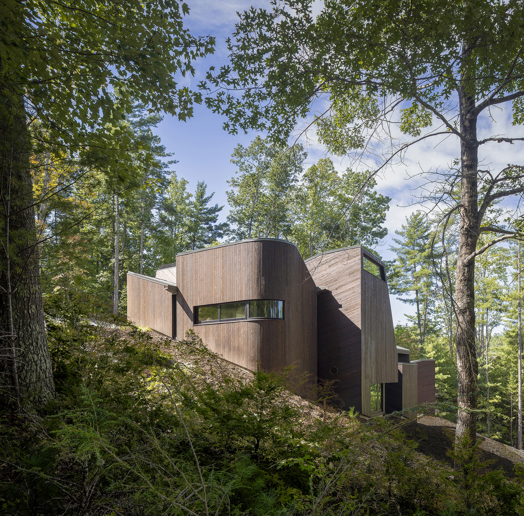
The site for the Nebo House is an elongated waterfront plot with a dramatic slope, located in the Appalachian foothills. In the center of the lake and directly opposite the site lies Big Island, with two mountains to either side in the distance. The house is conceived as a layered, volumetric foreground to this setting. Two retaining walls are cut diagonally across the plot, forming a duo of earthwork courts that have been carved out from the steep incline. A cluster of eight volumes, each loosely housing a component of the domestic program, is set along the retaining spine of the lower court, framing the lake and mountains beyond. The main floor of the house is embedded into the hillside, views focused outward to the lake with Southern light filtering in from clerestory windows above. The sunken day-to-day spaces are surrounded by earth on three sides, allowing thermal mass to replace a significant portion of the typical required heating and cooling load. Strategically placed operable windows for natural air flow and a heat pump mechanical system are accompanied by high-performance glazing, insulation, appliances and LED lighting to reduce the client’s energy usage by half as compared to their previous local residence. Designed as the permanent home for a retired couple with family nearby, the spaces are scaled to be intimate for a duo while also providing for occasional gatherings and larger celebrations. All daily programs exist on the lower floor with a central courtyard splitting the primary program into two wings. To the East of the courtyard are social areas and to the West is a private sleeping and bathing suite—Day and Night. The inside-outside scheme is inspired by the ancient courtyard houses in the stone villages of the Heibei province which we visited in 2016. A hall which acts as a mechanical and structural spine along the rear retaining wall connects the private and public spaces. The larger, public zones of the interior radiate outward from the courtyard and gradually break up into more intimate niches around the periphery that provide semi-private moments within the open living areas. A sculpted cantilever staircase slices upward to the entry and guest rooms above, forming a continuous three dimensional void capped by a skylight at its peak. Above grade, the house appears as a cluster of small pavilions along the hillside. Each pavilion is shaped to frame views of the external landscape and amplify the shifting tones of natural light within. Their roof forms direct water toward internal box gutters that terminate in large tapered scuppers marking the joints between each volume. The dark, charred cypress exterior reinforces the massing of the pavilions as opaque volumes set alongside the surrounding trees. At thresholds and entry points, concave inflections lined with brushed, amber-hued cypress are carved out of the volumes. As the sun travels from the Day side of the house to the Night side, its appearance shifts from a gathering of textured volumes to a flattened silhouette against the distant landscape. CreditsArchitecture Firm: Fuller/Overby Architecture Website: www.fulleroverby.com Instagram: www.instagram.com/fuller.overby Location: New York City Lead Architects: Emma Fuller & Michael Overby Photography Credits: Paul WarcholPhotographer’s Website: www.warcholphotography.com E-mail of Photographer: pw@warcholphotography.com Consultants Structural Engineer: Nat Oppenheimer, Silman Associates Mechanical Engineer: Mark Cambria, Fusion Systems

住宅建筑设计 全球五强
获奖者:mf+arquitetos
获奖作品:lake house
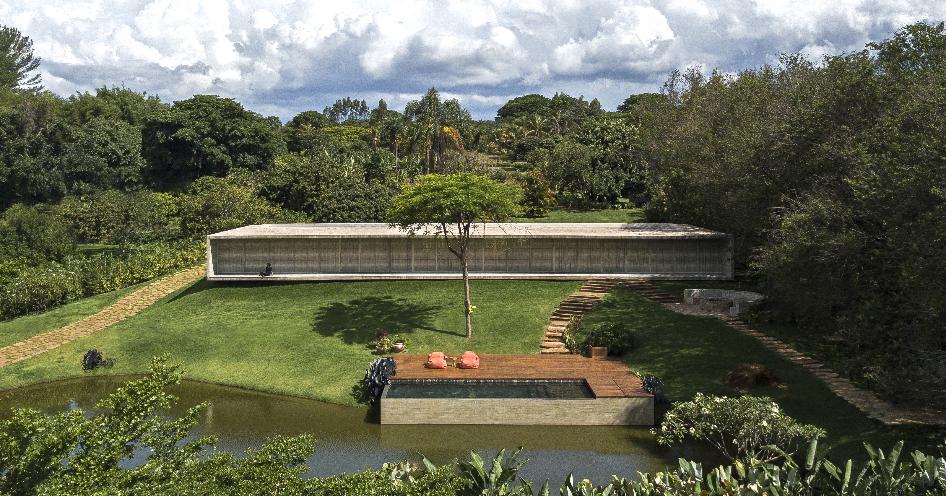
Upon entering the property, the visitor sees the pool inserted on the shores of the lake and arectangular block of 36.5 linear meters!The subtle feeling of not touching the ground, transforms the brutality of this concrete block intoan elegant lightness, its proportion is entirely linked to the proportion of the human scale, with aceiling height of 2.60 the architecture seems to frame the surrounding nature.The entrance to the house takes place on the opposite side, there you can see two morevolumes covered in stone and both appear to be inserted within the concrete block, one on eachside. Between them, a reflecting pool with a walkway invites you to access the house. Thesestone volumes house different functions: one houses the two suites and the private garden ofthe master suite, and the other houses the garage, laundry room, toilet, wine cellar and kitchen.When crossing the walkway, the glass doors open completely and the large living roomintegrates with the water mirror and also with the lake! The gap open to the front and back ofthe land, brings nature inside in a very intense way.The living room has a smooth composition of materials: stone floor and walls, concrete ceilingand wooden panels.This clearer and more welcoming composition of natural materials contrasts with thecomposition of furniture textures, such as leather and linen.Light invades the interior through the rope brises, which bring beauty and dynamism to thefacade, helping to provide sun protection and also privacy, when necessary.The house brings very pure lines throughout its extension, direct connection with nature and theviews, authentic materials,


