说明:
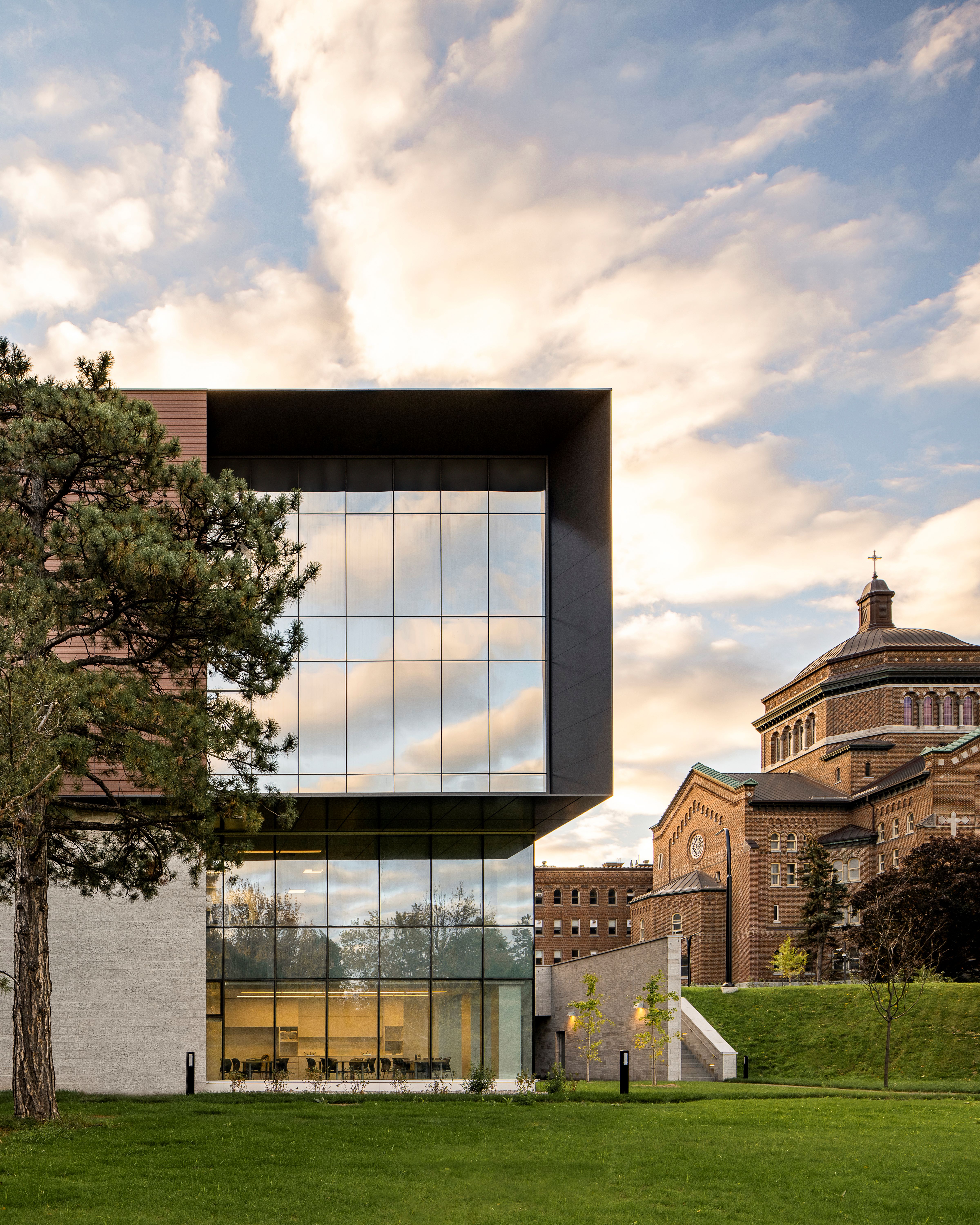
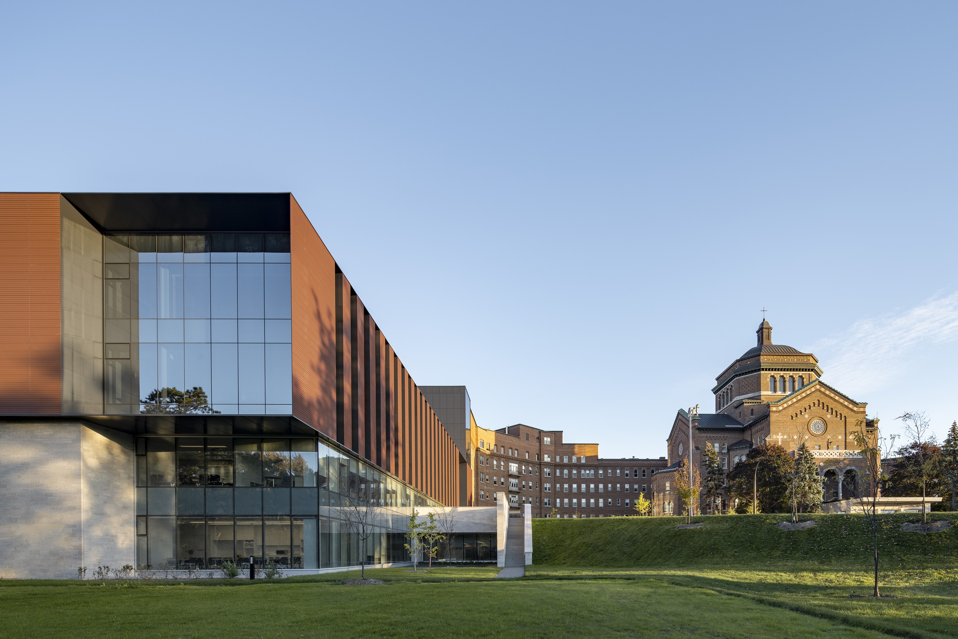
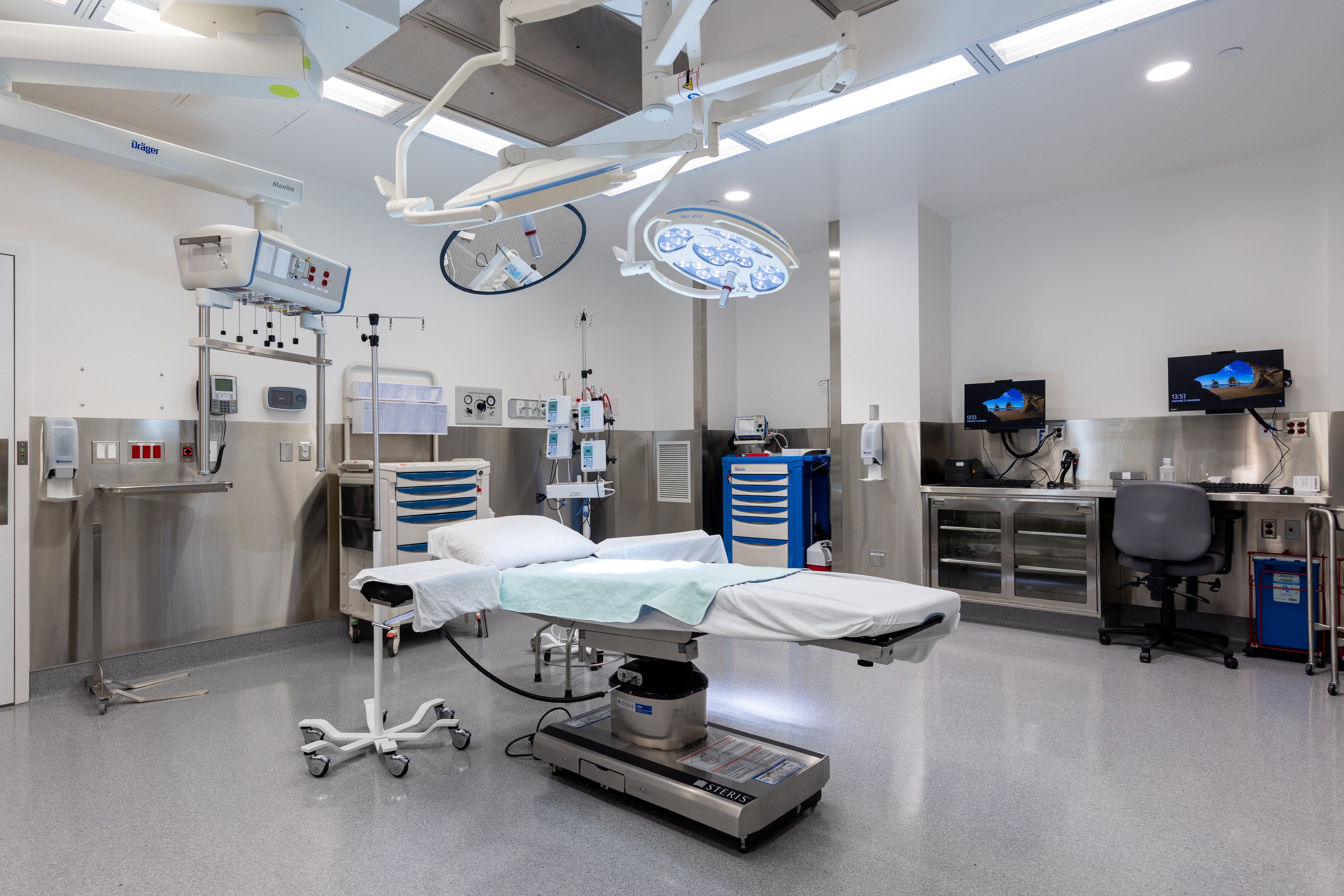
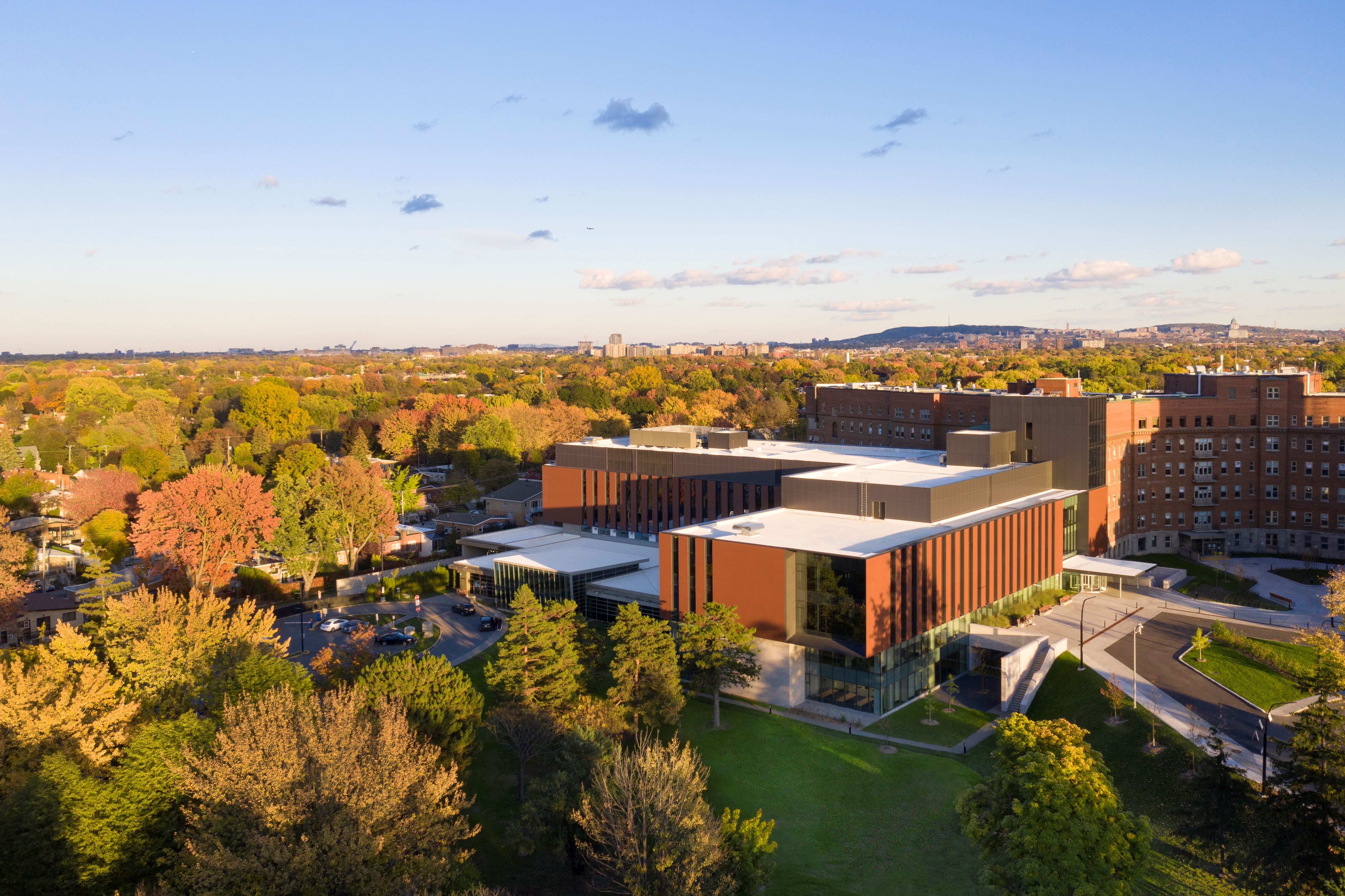
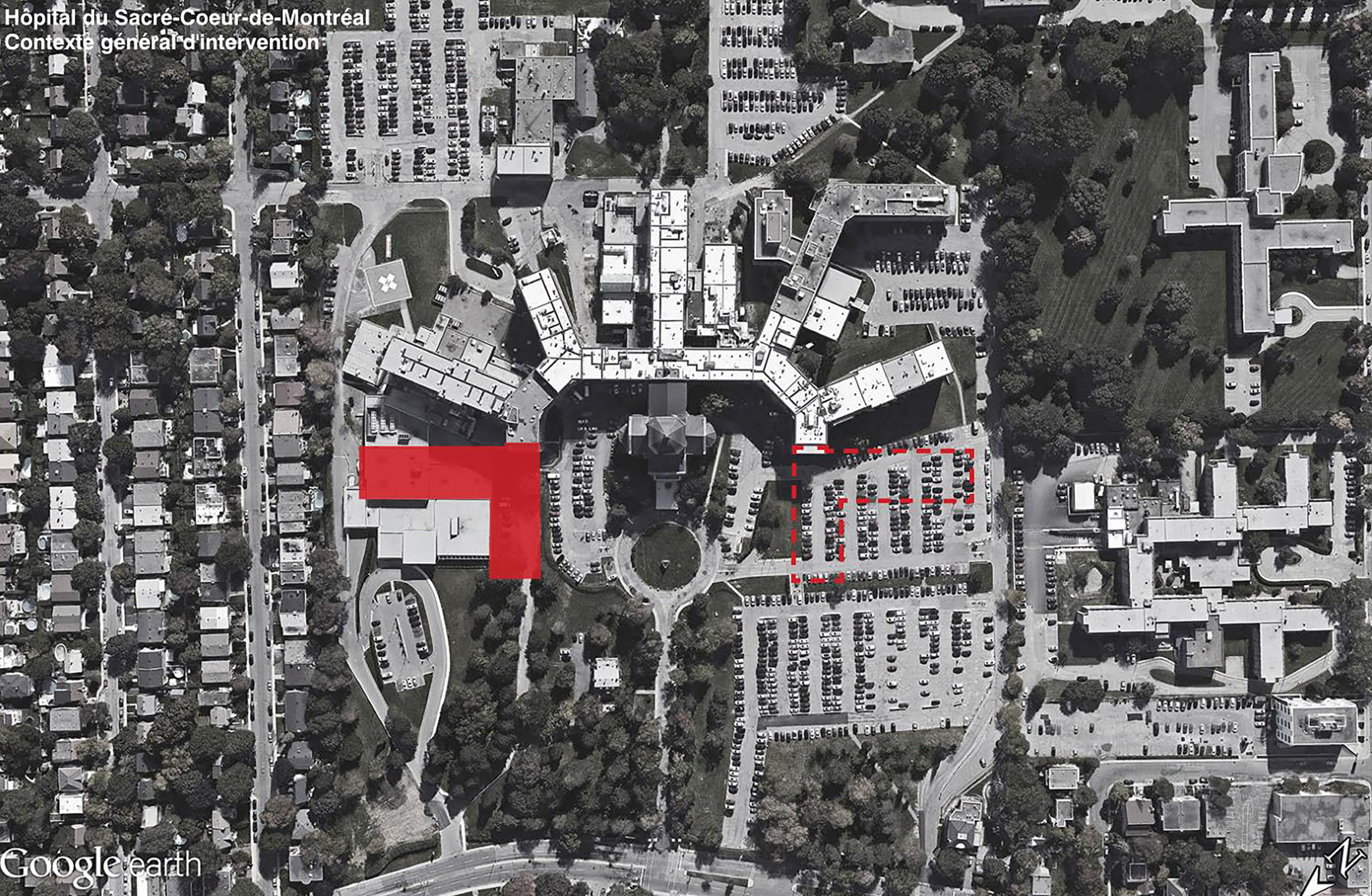
The architectural intent of the team is supported by the vision to create an innovative and contemporary health care facility that is anchored in and complements the historic hospital campus. Affiliated with the Université de Montréal, the Hôpital du Sacré-Cœur de Montréal (HSCM) is one of the largest ultra-specialized trauma centres in Quebec. The 6 story L-shaped expansion spans 16,252 m⊃2;. The new volume comes to rest above the existing emergency department, which was kept in operation throughout construction. The project features an integrated trauma centre, an endoscopy unit, mother-child and obstetrical units, a medical device reprocessing unit (MDRU), as well as research laboratories and teaching facilities.
The Integrated Design Process (IDP) team ensured that the needs of all stakeholders were met throughout the design process. The shared common goal, to deliver a state-of-the-art building in harmony with its surroundings and based on a set of sustainable strategies (LEED and WELL), informed the design decisions. Maximizing views towards the sprawling bucolic site, referencing the historic building’s materiality as well as taking advantage of access to natural light, are the project’s primary aims.
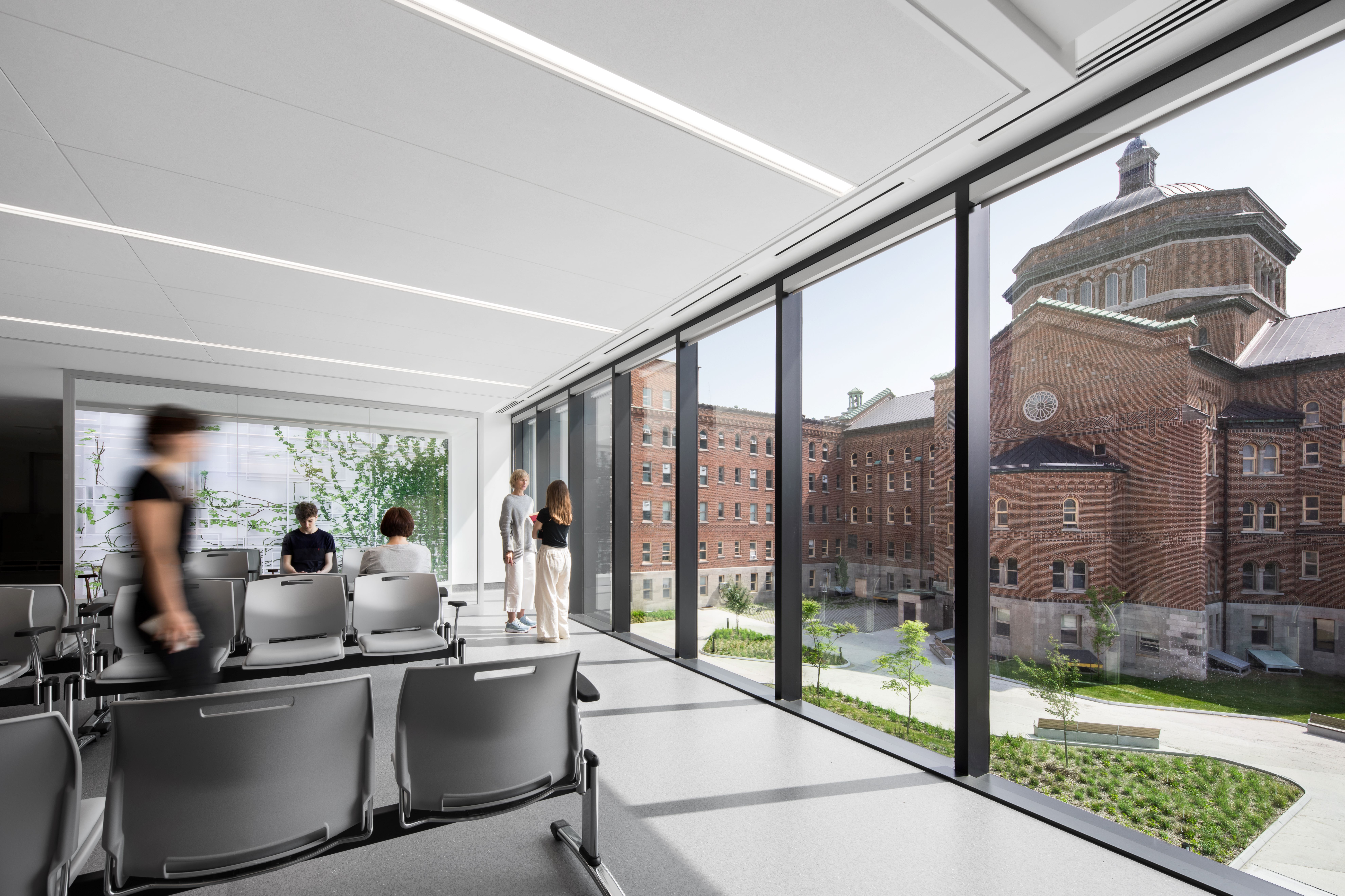
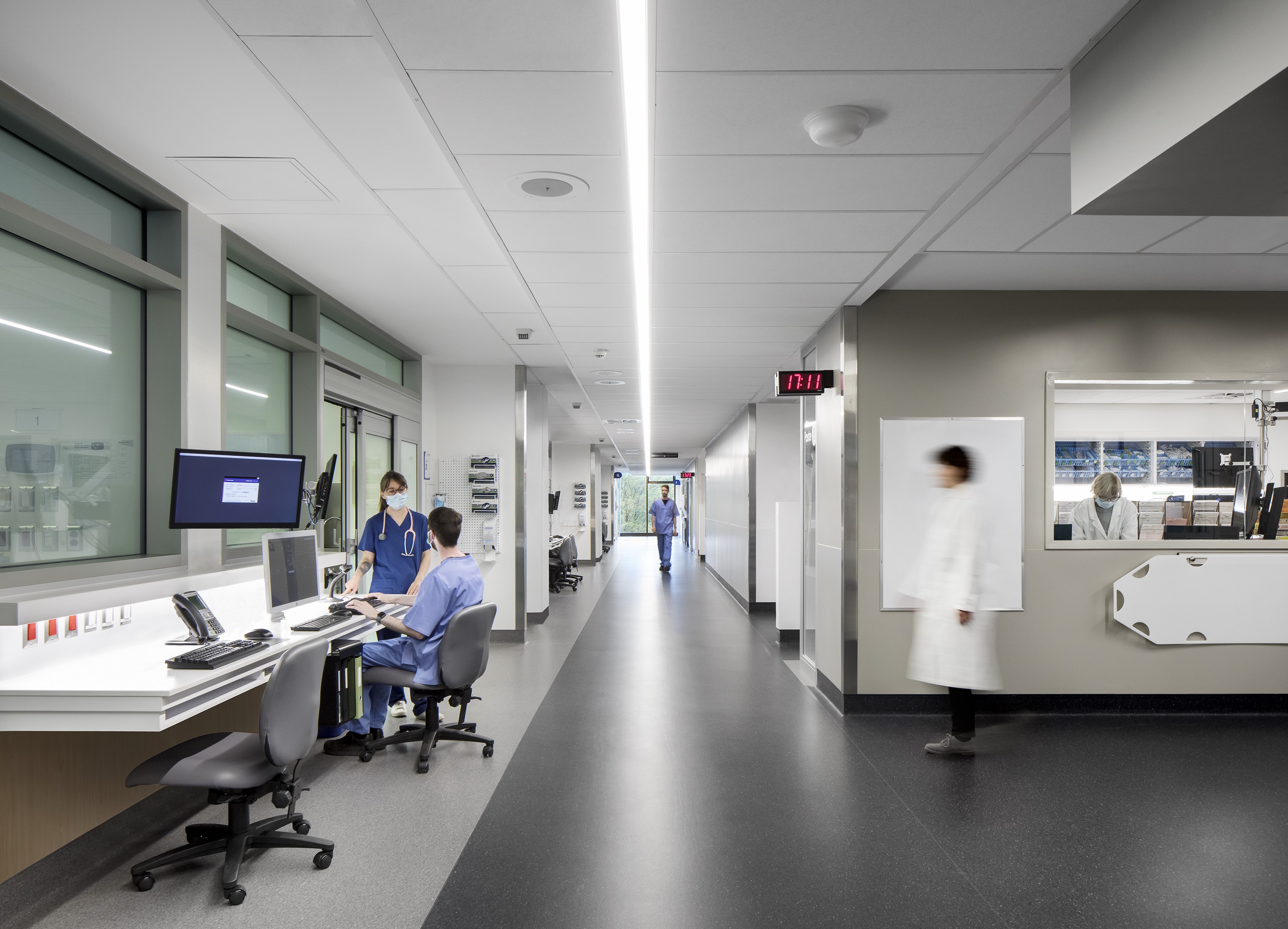
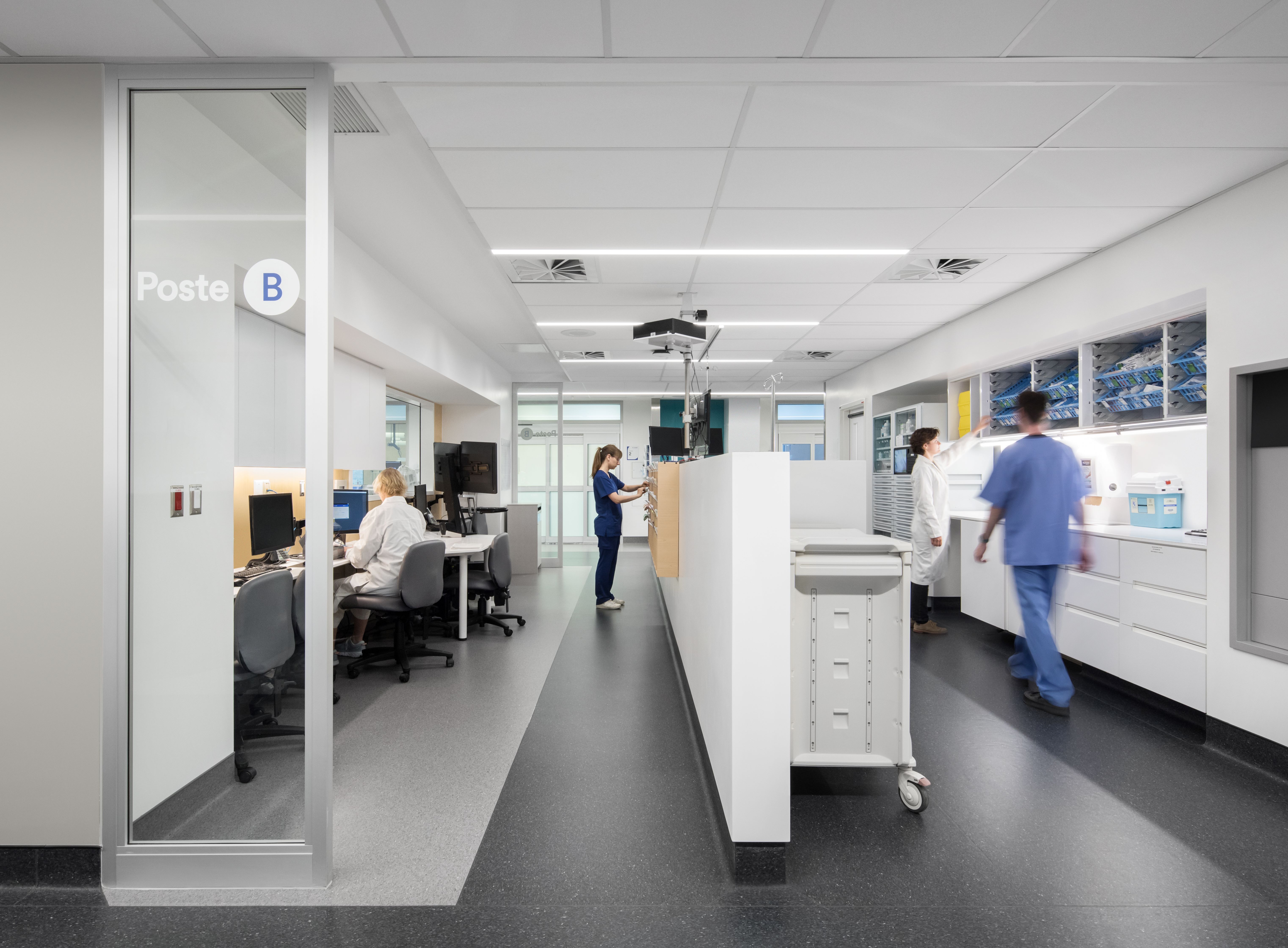
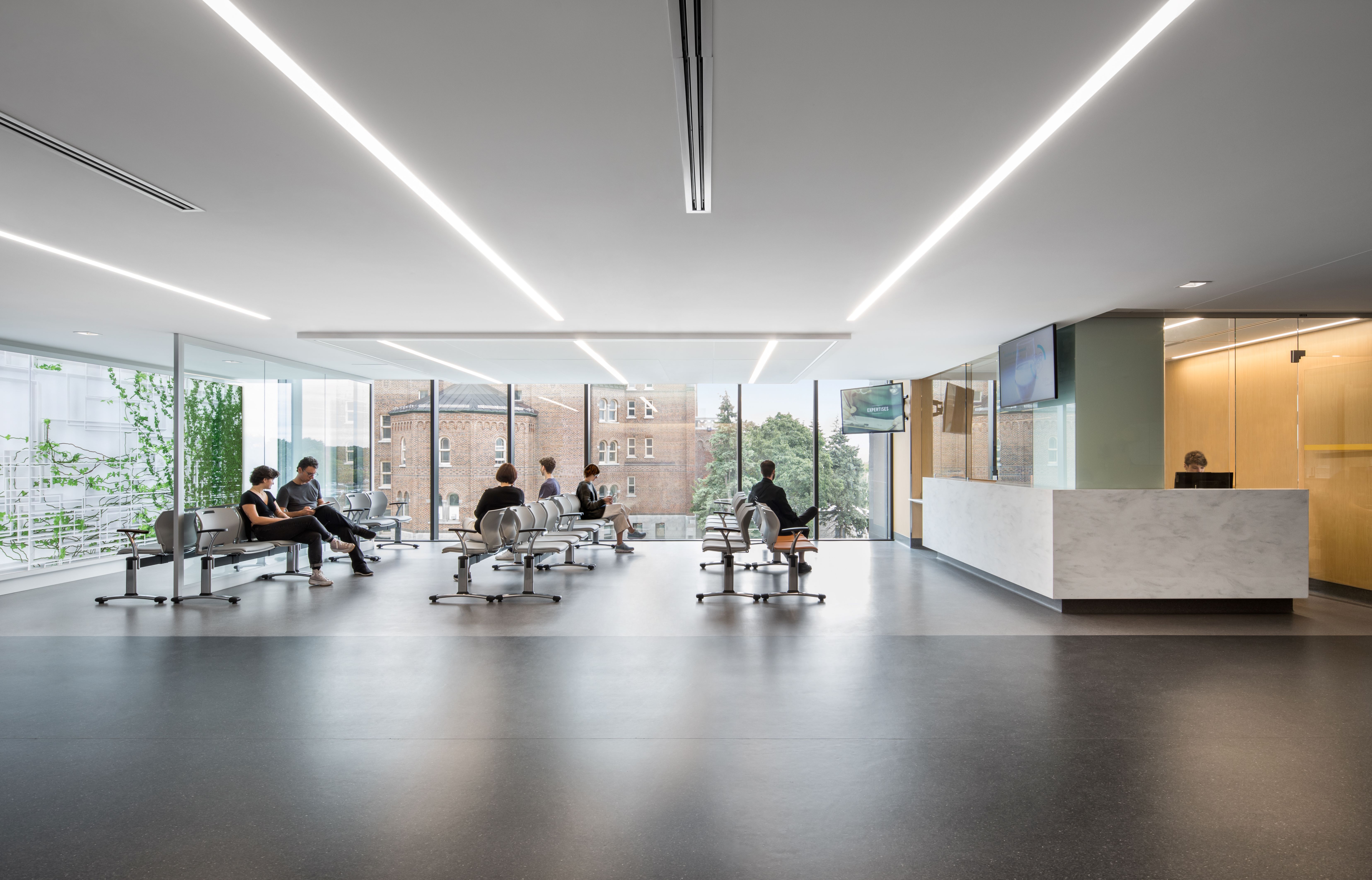
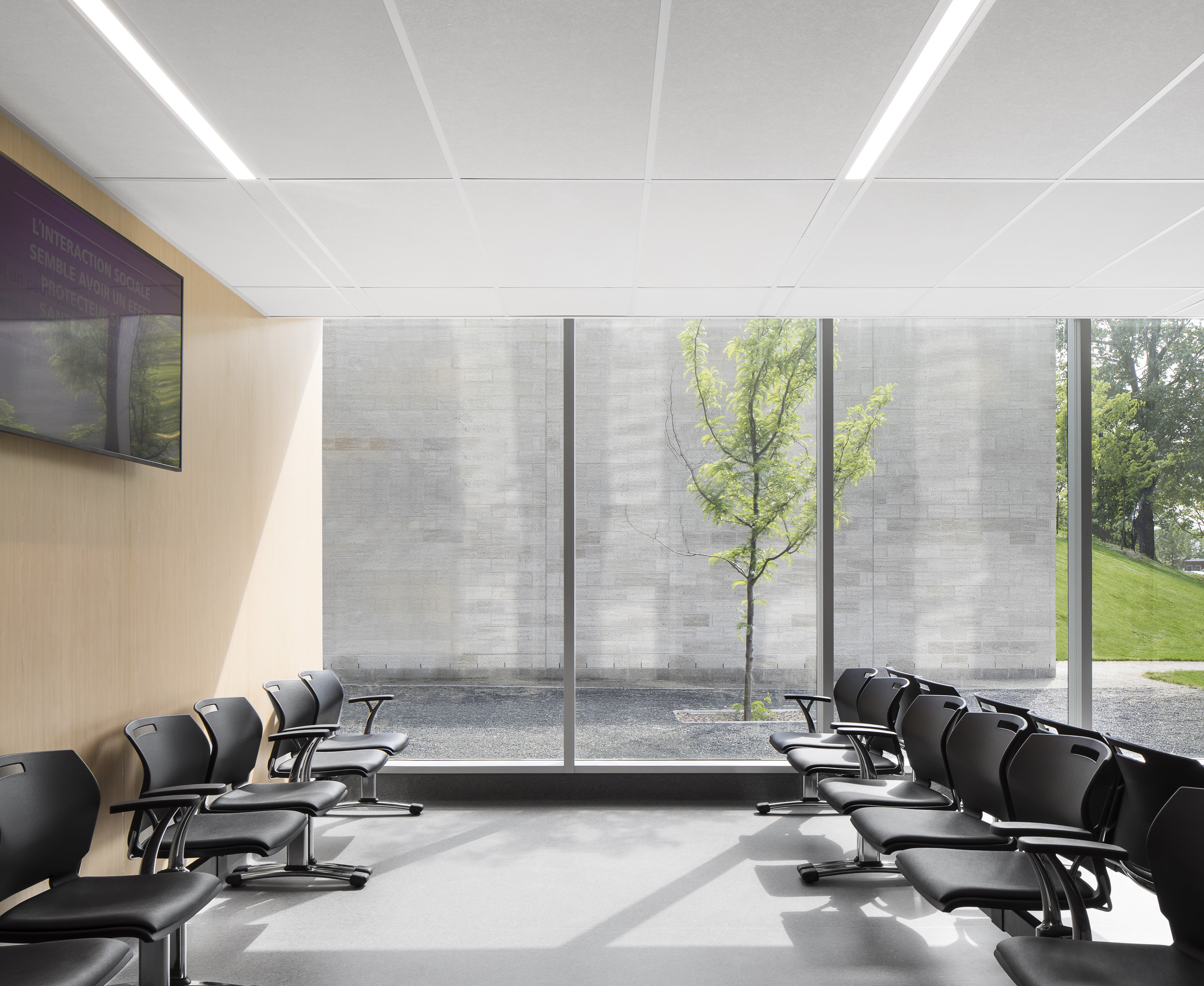
The well-being of both patients and caregivers was at the heart of the design team’s priorities. In addition to providing functional spaces, where staff insight was gathered through the fabrication of full-scale mockups, the design harnessed the therapeutic benefits of natural light at every occasion. This was inspired by the history of the institution—HSCM was initially specialized in the care of patients with tuberculosis, for whom access to fresh air and sunlight were essential for healing. In order to give the extension plenty of daylight, the corridors and public spaces open onto windows and all patient rooms have floor to ceiling windows as well. This makes for welcoming and calming healing environments where outdoor views of nature contribute to improved patient outcomes and increased staff satisfaction.
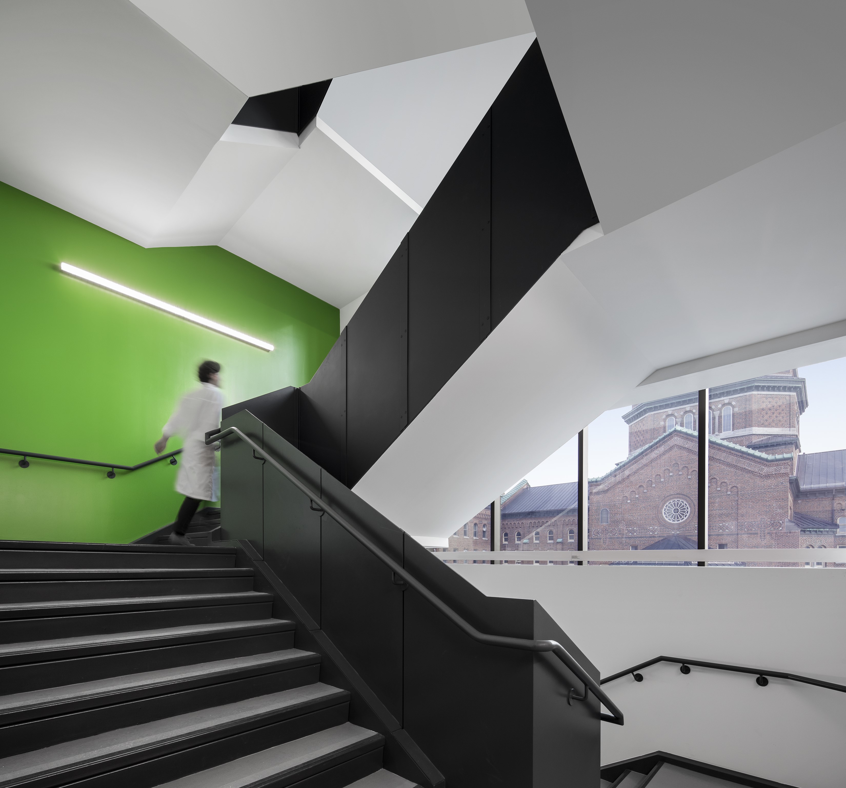
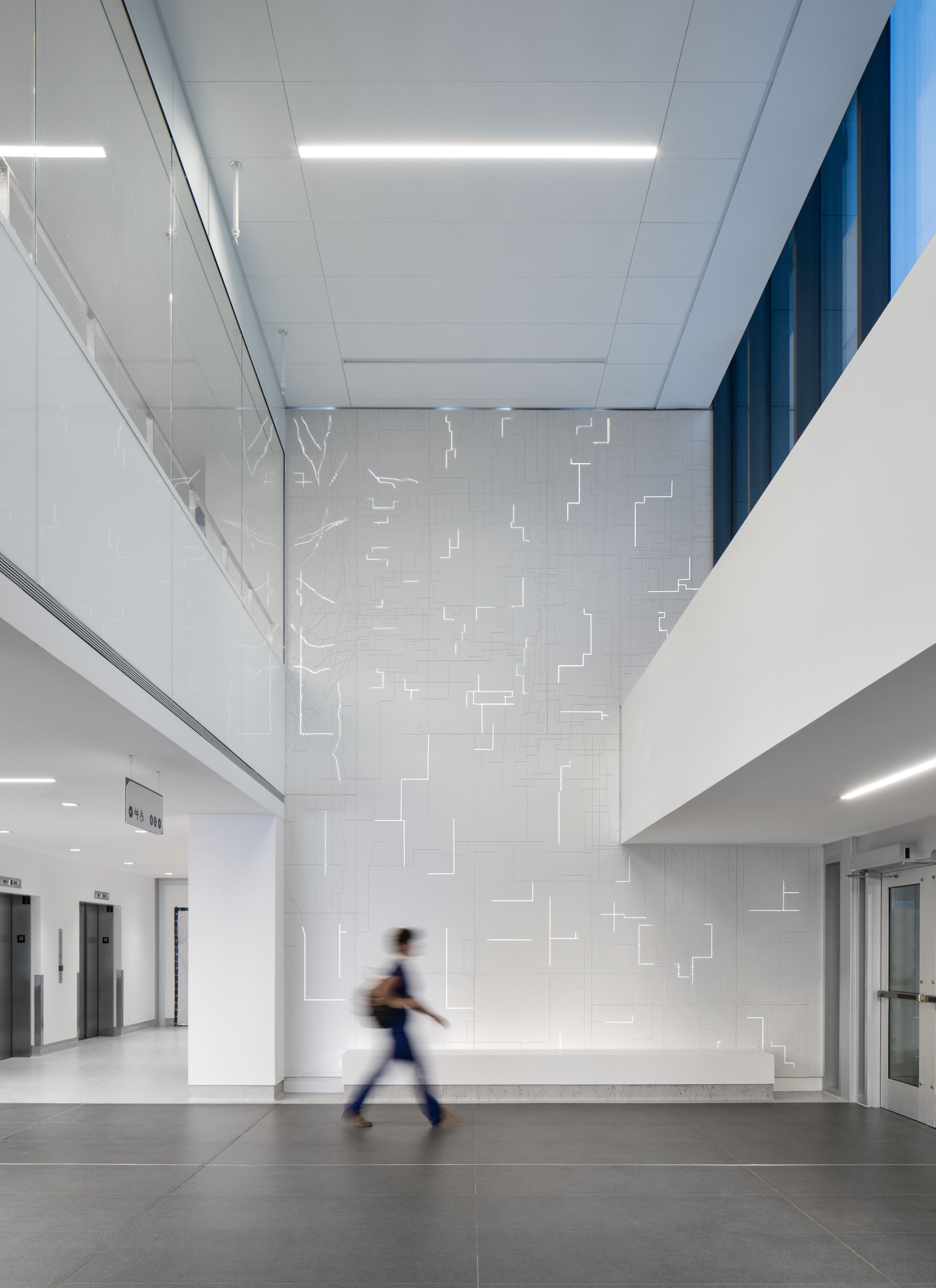
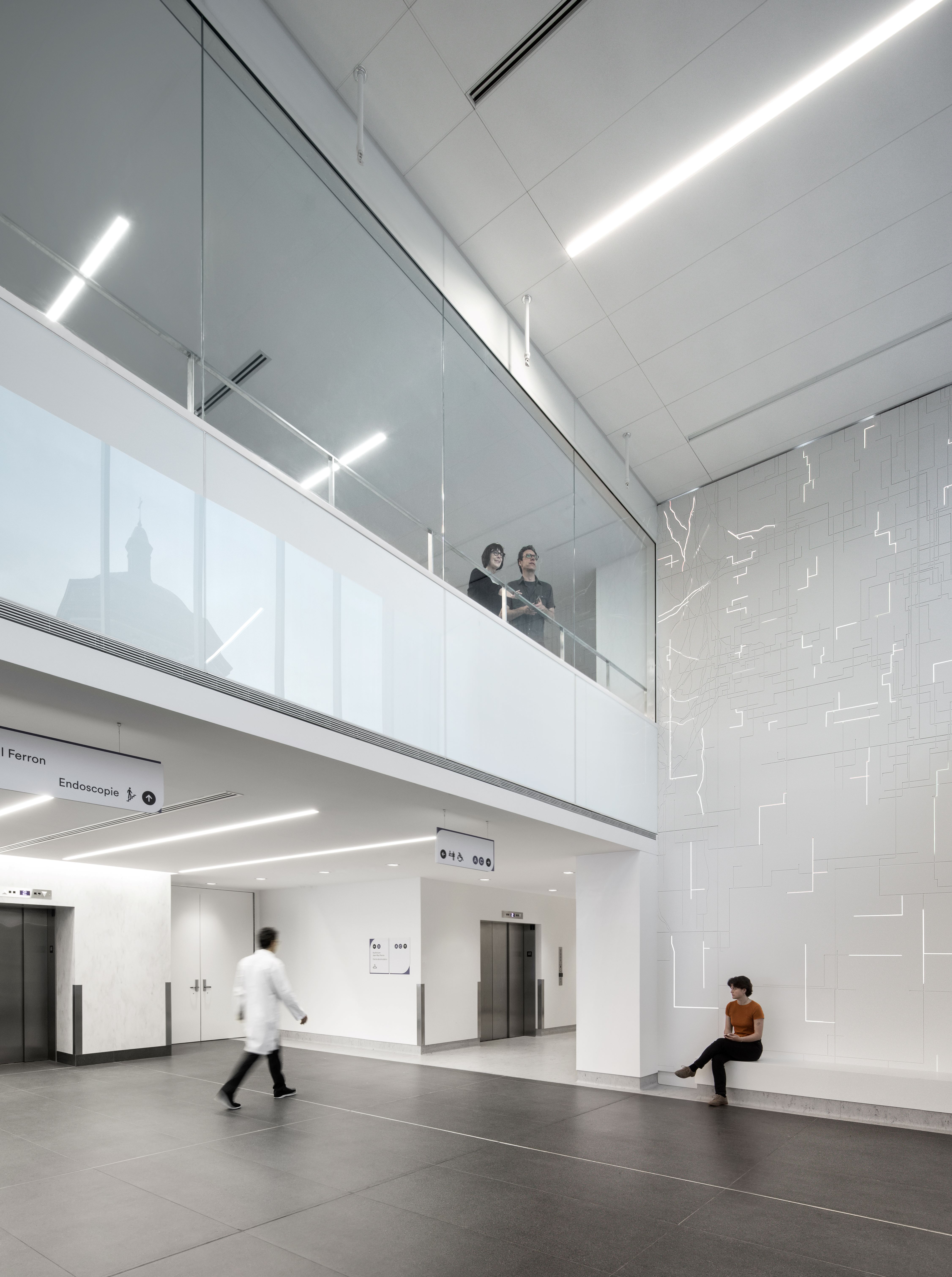
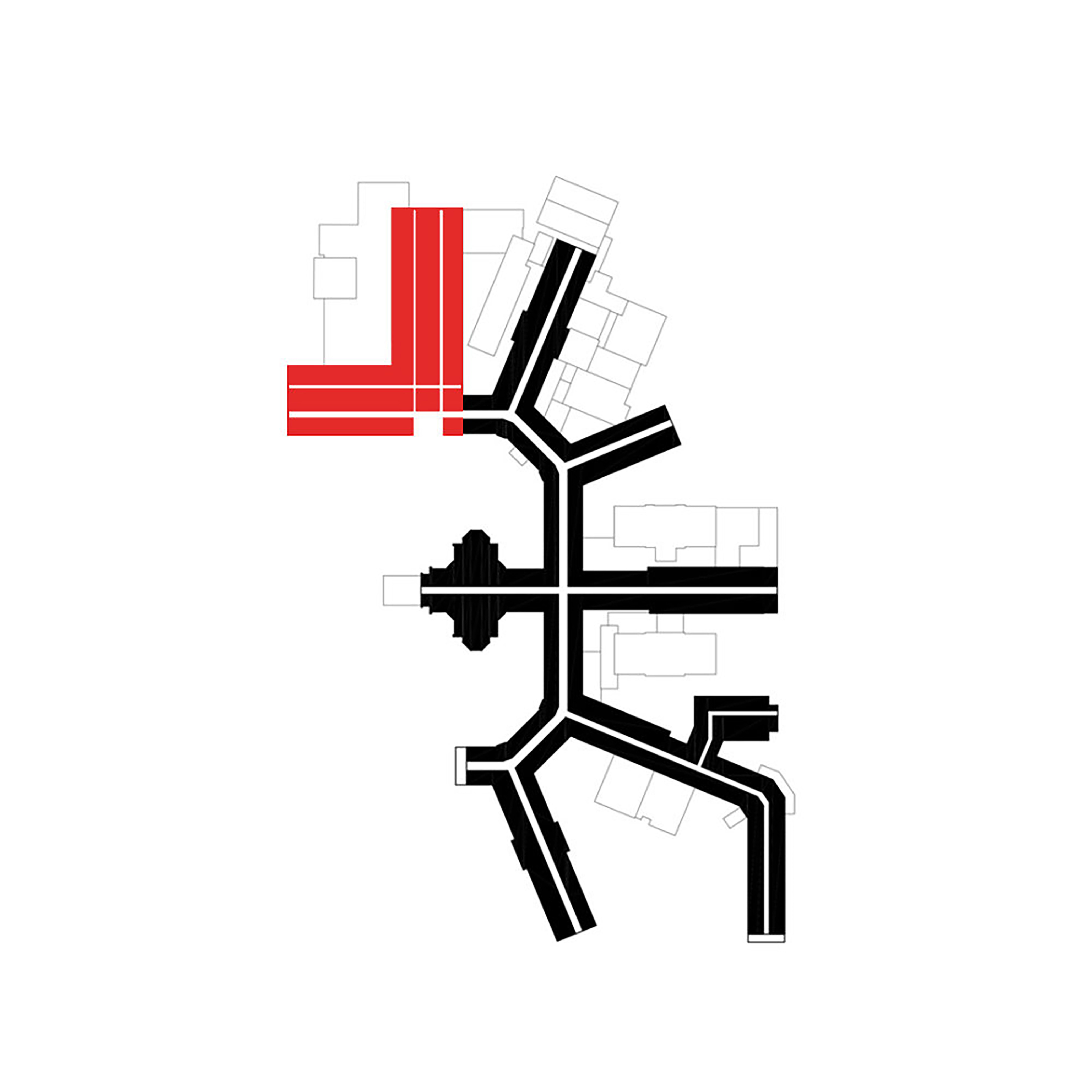
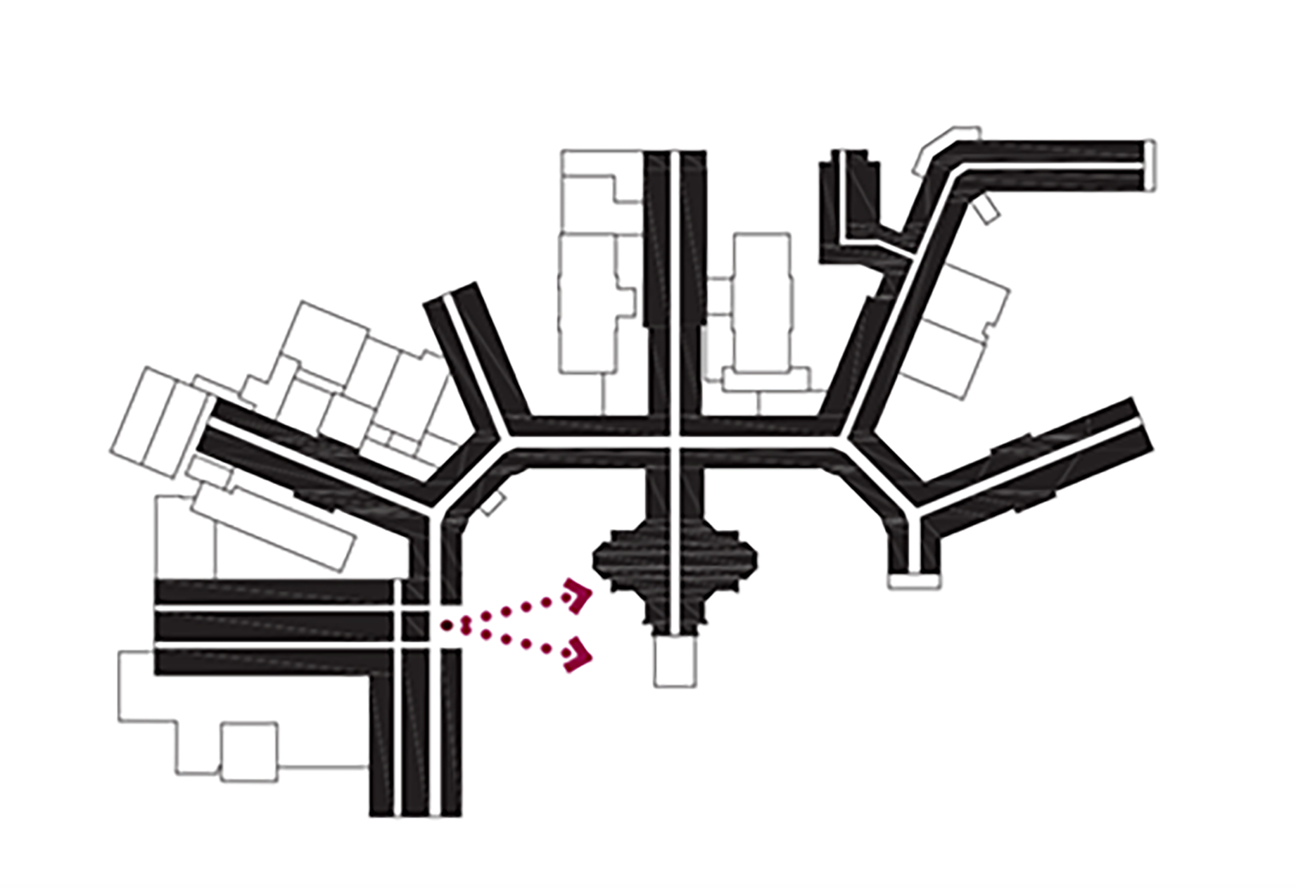
In order to preserve the original layout of the imposing building, the designers took great care to insert the extension in continuity with the existing plan, thus respecting the initial scheme. This preservation effort ensures that the circulation paths fit harmoniously into the overall plan; an intangible fragment of the place's heritage is thus assured. Moreover, this organization results in an optimized wayfinding strategy. At each end, every main interior pathway opens up to the outdoors, making these rather functional spaces luminous and more user-friendly. To further facilitate the wayfinding of users and to highlight the identity of the site, on each level, the public paths and elevators open up to the former chapel. Thus, as they move around, visitors are constantly in touch with the natural site and the chapel, the institution's symbolic landmark.
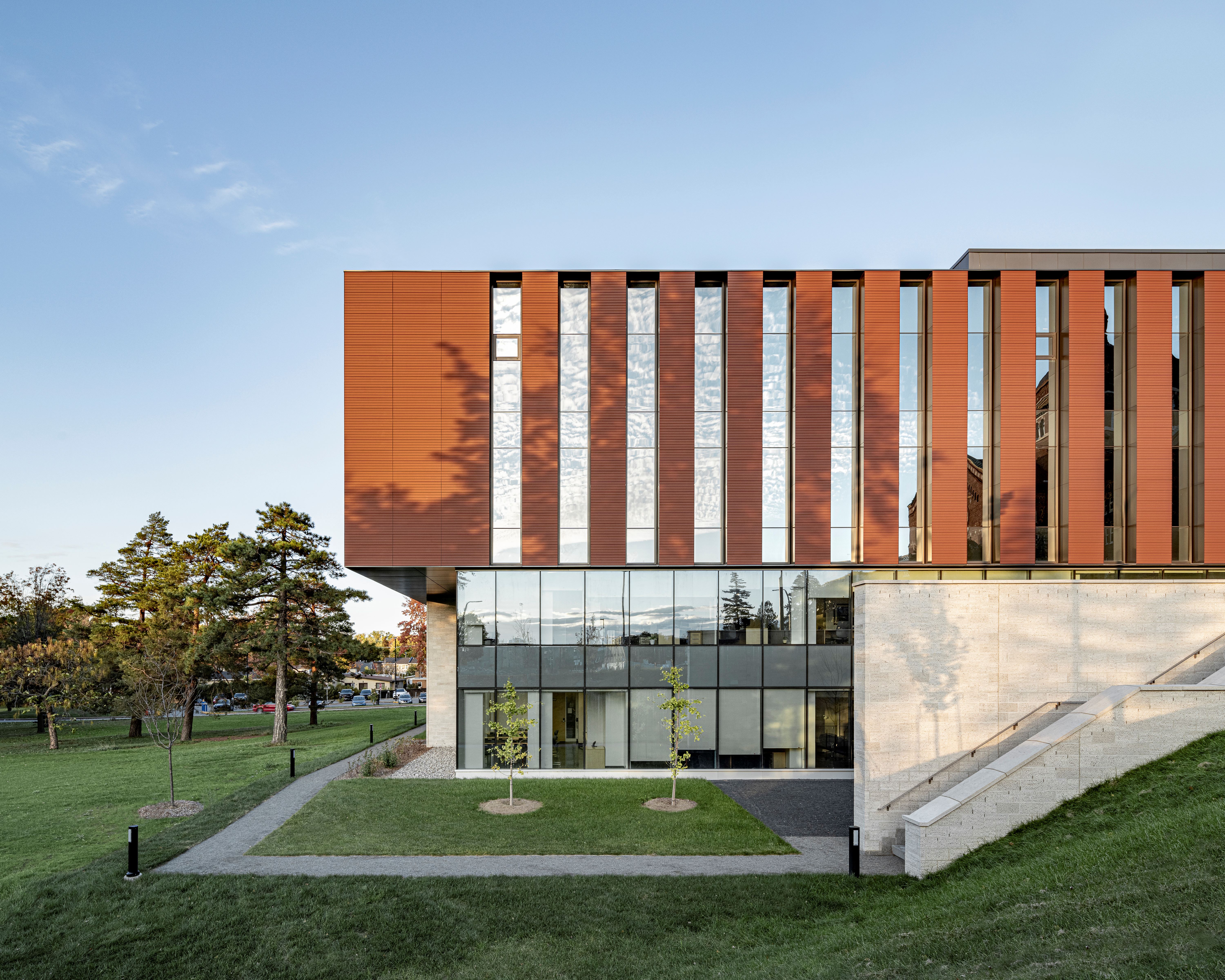
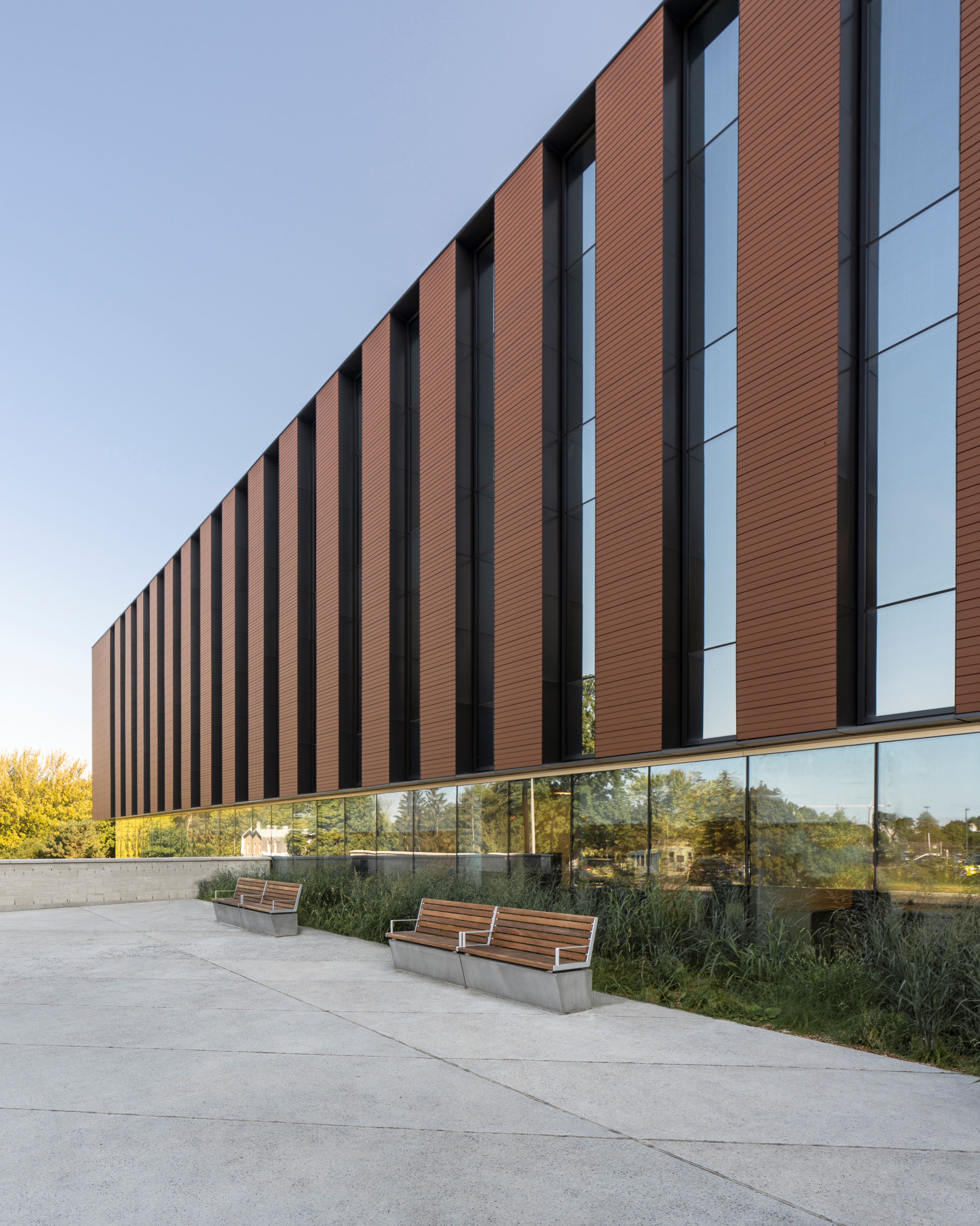
The addition’s sobriety contrasts with the central chapel, the contemporary addition is refined, a tribute to rather than in competition with history. The abundance of glazing frames and reflects views of the surrounding architecture, providing a sense of place and continuity for the users. The façade’s treatment with alternating vertical bands of glass and porcelain stoneware echoes the original hospital façade. The colour of the exterior mimics the red/brown brickwork of the surrounding buildings.
Planning had to be as efficient as possible while offering a welcoming atmosphere. For example, the endoscopy service was thought out according to the patient care pathway: reception, preparation, intervention, and collection follow one another in a clear and simple way for the clientele. We should also mention that the succession of services from one floor to another was also studied in-depth. Thus, the sequence was established to prioritize optimal connexions between the complementary services and maintain safety, security, and efficiency.
The interiors are characterized by warm, calming materials like wood while accommodating the hygiene and sanitization requirements required in the hospital setting. New gardens allow patients, visitors, and staff to enjoy spaces for quiet contemplation and rest as well as boost exposure to natural light.
The upper levels of the new volume contain patient rooms, the curtain wall is broken up into vertical bands by terracotta-colored porcelain stoneware cladding. The plan creates a feeling of rhythm across the facade while also echoing the brick exterior of the historic hospital's facade. The choice of materials is in line with the durability and sustainability requirements for the building. The porcelain stoneware panels are suspended from an aluminium sub-support structure, providing masonry installation durability without the additional weight. In fact, the volume appears to float above the glazed lower levels, where patients in waiting rooms and cafés enjoy sweeping views of the grounds and the historic architecture.
The designers bet on an overall appearance of simplicity. Thanks to this strategy, the new wing is part of a vision of sustainable development for the campus—which facilitates the integration of future expansions—while ensuring the architectural and cultural durability of the original historical building.

1_HSCM_wing facade

2_HSCM_wing facade

3_HSCM_public exterior garden

4_HSCM_waiting room

5_HSCM_stairs with wayfinding landmark

6_HSCM_caregivers working space

7_HSCM_caregivers working space

8_HSCM_obstetrical room

9_HSCM_public space

10_HSCM_public space

11_HSCM_waiting room

12_HSCM_waiting room

13_HSCM_wing facade and exterior public space

14_HSCM_wing facade and exterior public space

15_HSCM_Campus view

16_HSCM_extansion implantation

17_HSCM_extansion implantation with circulation scheme

18_HSCM_extansion implantation with circulation scheme
查看更多
 打开微信扫一扫
