


 打开微信扫一扫

复制链接


公共建筑设计 提名奖
获奖者:MVRDV
获奖作品:The Imprint
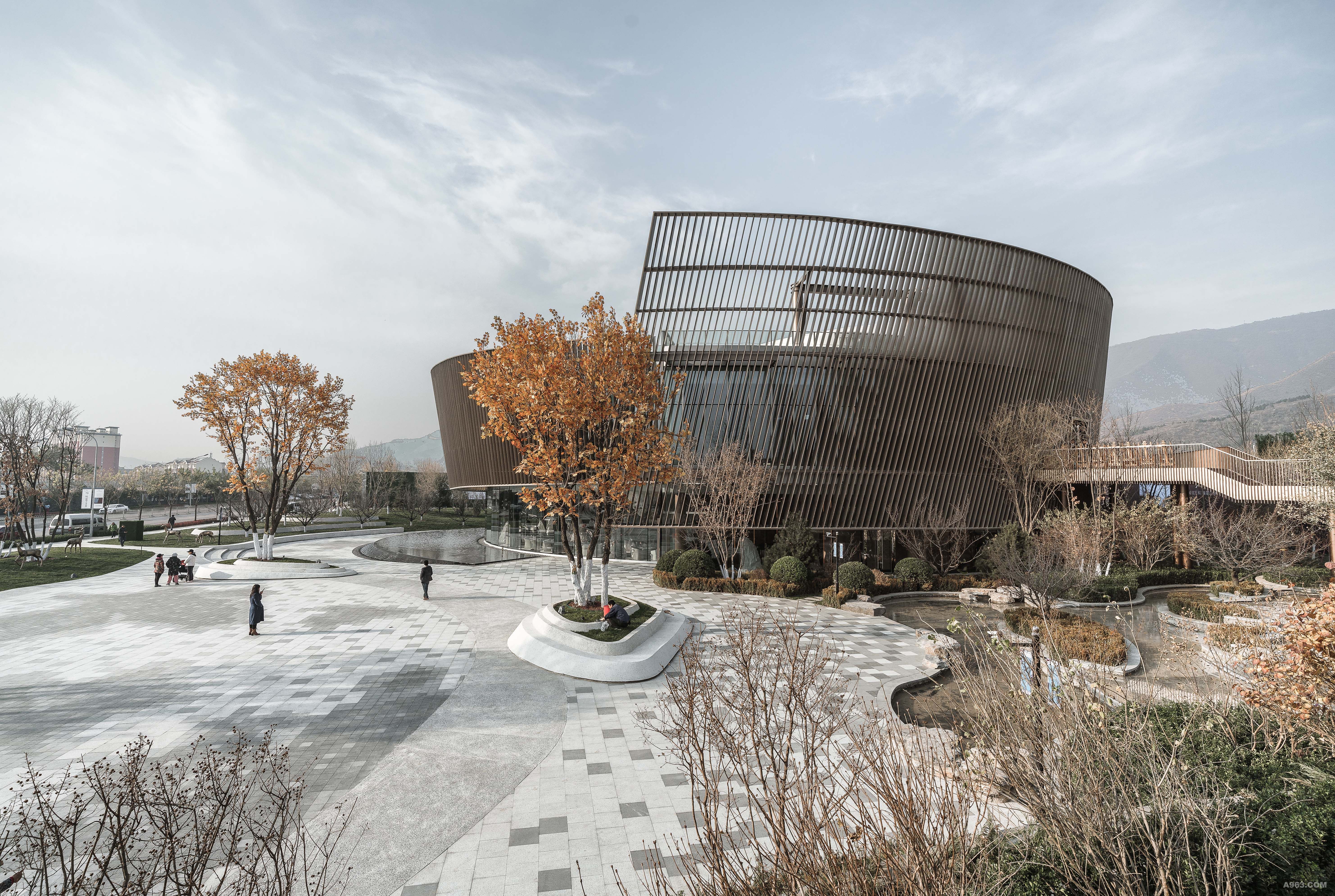
MVRDV’s The Imprint, a dual structured entertainment facility, sits as the centerpiece of a new tourist hub in Incheon near Seoul, South Korea. The sibling buildings, the Wonderbox and Nightclub, share an architectural language; both becoming an echo of their family, the immediate MVRDV’s The Imprint is part of the larger Paradise City complex of 6 buildings in total, which will provide a full suite of entertainment and hotel attractions less than a kilometer away from South Korea’s largest airport. Given the proposed programme of the 2 buildings – a nightclub and indoor theme park – the client required a design with no windows, yet one that still integrated with the other buildings in the complex. The design of The Imprint therefore arises from a simple question: can we design an expressive façade that connects with its surroundings even though it has no windows? The design achieves this by projecting the façades of the surrounding buildings in the complex, which are ‘draped’ over the simple building forms and plazas like a shadow, and ‘imprinted’ as a relief pattern onto the façades. “By placing, as it were, surrounding buildings into the facades of our buildings and in the central plaza, we connect The Imprint with the neighbours,” says Winy Maas, principal and co-founder of MVRDV. “This ensures coherence. Paradise City is not a collection of individual objects such as Las Vegas, but a real city.” In order to achieve the desired ‘imprint’ of the surrounding buildings, the façade of The Imprint is constructed of glass-fiber reinforced concrete panels. As many of the 3,869 panels are unique, the construction required molds to be individually produced using MVRDV’s 3D modeling files from the design phase. Once installed, these panels were painted white in order to emphasize the relief in the design. As Winy Maas explains: “Two months ago most of the cladding was done and client said, ‘this is an art piece. What is interesting about that is that they are looking for that momentum—that entertainment can become art or that the building can become artistic in that way. What, then, is the difference between architecture an art? The project plays with that and I think that abstraction is part of it, but it has to surprise, seduce and it has to calm down.” The golden spot is the project’s most obvious and attention-grabbing expressive element, even catching the eyes of passengers coming in to land at Incheon Airport. The golden color is achieved simply, by using gold paint instead of white, and is reinforced by the lighting of the facades at night: while the majority of the façade is lit from below, the gold spot is highlighted from above. “The virgin building has received a splash of gold. This makes it as if the entrance is also illuminated at night by a ray of sunlight,” says Maas. “Passengers in the incoming aircraft can already see this ‘sun’ from above the ocean, as a kind of welcome to South Korea.” The entrances, where the façades are lifted like a curtain to reveal mirrored ceilings and glass media floors, exude a sense of the excitement happening inside. “Reflection and theatricality are therefore combined,” concludes Maas. “With our design, after the nightly escapades, a Zen-like silence follows during the day, providing an almost literally reflective situation for the after parties. Giorgio de Chirico would have liked to paint it, I think."
公共建筑设计 提名奖
获奖者:上海日清建筑设计有限公司
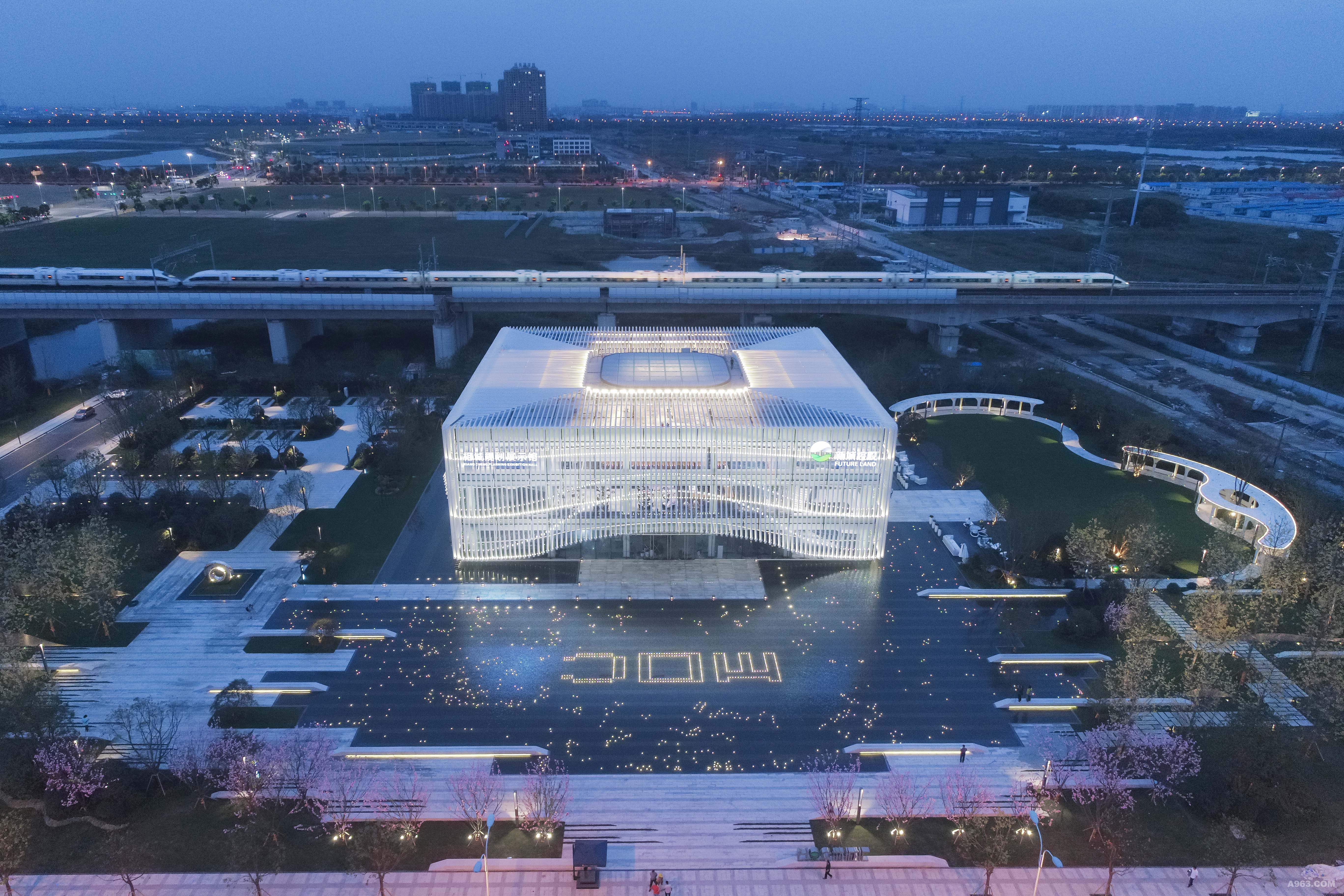
获奖作品:新城控股MOC芯城汇展示中心
每年流经苏州北站的客流量达上亿量级,高铁进站前减速,正好将展示中心一览无余!区位的优越性决定其独特性:建筑各个看面都非常重要。我们进行了两种思路研究;一种是园林式,用一些围和元素进行空间限定,达到空间有序变化显然类似园林式售楼处的做法很难实现建筑所承载的含义。我们选择了另一种思路,做一个点,整而不散,让其成为城市地标,视觉焦点! 经过很多轮的方案比选,最终选定了方形建筑方案。方形建筑要做到干净大气必须掌握好比例、研究好肌理。这样,把1.17公顷的基地作为"面",把京沪铁路作为"线",把建筑作为"点"让点、线、面在这个项目里完美地组织在一起。 在项目景观打造上,我们强调水景的应用,为保证倒影的完整,将通往建筑主入口的道路设置在侧面,建筑飘逸的曲线外衣倒印在水中,显得那么的迷人,外表皮的形象构思来源于一种乐器,叫马林巴琴,建筑是凝固的音乐,我们希望这个小建筑能在水天的映衬下奏出美妙的乐章。
公共建筑设计 提名奖
获奖者:上海日清建筑设计有限公司
获奖作品:北京卓越万科翡翠山晓
区位 石景山区是北京西部的一个行政区,距离北京主城区14公里。项目地背靠石景山脉西山区,既可享受城市的便利又可触及自然生态。浅山区,城市和自然的交界地带,也是兼得地带,城市和自然一衣带水,既在山中,又在山外;既在城中,又在城外。 形体解读 我们希望这一片山野中,有一个很未来感东西能够落到这个商业区,就像一个太空的不明物体,落在了一片田野中,可以作为我们与未来的一种链接,连接后面的商业片区坡地的建筑形态,带动起一个比较生态的商业环境,达到一种人文形态的形式感的实现。 我们的场地处在一个空旷的场地中,周围缺少参照建筑,我们的建筑将面临重新定义这块场地的新属性,我们试图通过简单的几何形体,让人产生记忆深刻的印象。但面对新场地的时候又不想太张扬,因此圆弧的运用成为了我们的首选。圆弧有一种与生俱来的特质,在外侧看给人一种优美感,在内测看给人一种向心感。 椭圆的表皮做弧形上升的趋势,尽管这个给施工带来了更大的难度,但最后呈现出来的时候,我们依旧觉得这样的坚持非常有必要。螺旋上升的表皮活跃了整个外立面,形成了整个建筑的视觉焦点,也使得我们的建筑不像传统几何圆形那么生硬,多了一份秀美。同时又恰到好处的和远山形成了呼应,这种若离若合的和谐正好符合浅山区域的一种生活气质。 在这个项目中,商业地块和山晓剧场是靠山这边,跟山去对话,让它更紧密、更时尚、更现代、更纯粹一些。到居住社区,偏向于城市过度了,偏居住形态,一边在城市之中,一边在浅山之上,从而很好的把文化、商业、社区做了一个平缓的地势过渡,实现浅山有语、城市有声的状态。 北京的秋天在庄严肃穆中点缀着些许明亮的色彩。我们的外立面材质选用一种特别调制的香槟色铝板,具备金属的质感同时又不是特别的跳跃,我们希望外立面材质能和北京的色彩更协调一些。 内部游览 在室内,以"山间剧场"为核心空间。为了加强剧场互动交流的公共属性,我们围绕椭圆剧场打造贯通首层至屋顶的环形走廊。 环形走廊不仅仅是增强的视线交流,同时空间的联系互动更加有效。而且这种互动非常自然,椭圆剧场的长轴跨度达31米,大大降低了环形走廊的坡度。这样坡道走起来方便省力,同时也更加有趣。 围绕中央核心剧场和大椭圆之间的空间,以一种向心的方式安排了我们需要的功能空间,这样在空间的层次上做到了主次分明,同时又能形成我们想要的聚合向心的空间感受。
公共建筑设计 提名奖
获奖者:UAO瑞拓设计
获奖作品:地形故事学:水平与向上/庭瑞小镇斗山驿文化会客厅
项目位于湖北省孝感市,场地是典型的江汉平原的丘陵地形。在项目伊始,设计师在考察地形后,将建设的基地选择在与乡道对面的水塘边,希望从高速下来的车辆,在拐进这条两侧种满意杨林的乡间道路后,第一眼可以远远看到建筑的全貌,从而形成一个对景的关系。 相地 在方案构思阶段,设计师多次往返现场,发掘基地的特质;阶梯型田埂成为设计的一个被刻意强调的自然要素,主创设计师李涛将一个长条形的体量搁置在水塘边的三级田埂高差之上,刻意保留的1500高差自然就形成了建筑室内或内庭院的两级空间。这个高差同时成为建筑外部形象的直接反应&mdash&mdash坡屋面:较低的临水屋檐一侧,自然对应的较低的田埂一侧,檐口高度4米;较高的屋檐一侧,对应较高的田埂一侧,檐口高度6米;而内部高差的处理,在不同空间里有着不同的表达方式,客观地反应出空间的功能和节奏。 水平线 临水一侧屋檐高度4米,建筑总长度104米,长度和高度的比例关系形成了本项目的最大特征:建筑仿佛趴在水塘边,形成一个低矮水平谦虚的形象;同时,主体建筑平行于乡道,从乡道望过去,多条水平线集聚:乡道的护栏、水塘的边线、建筑前面的几级田埂、建筑的临水一侧的檐口线,建筑高侧的檐口线,内院及入口长廊的屋顶水平线,以及建筑屋顶的观景平台的水平线。这些水平线强化了江汉平原丘陵地形的特征。 场地漫步 漫步带来建筑不同的观感,但也会发现这个建筑并不存在一个传统设计意义上的"主立面",犹如柯布西耶的萨伏伊别墅,没有主要立面,也没有去强化入口形象,这是设计师的刻意为之,也是回应江汉平原这种平坦场地的无方向感。 内部空间节奏 在统一的大屋面下,设计师组织了五个盒子,两个内院,三段长廊,一段直跑楼梯,以及这些实体盒子与屋面围合的"剩余空间",共同形成了一个外部形象克制,而内部尤其丰富的游走空间。五个盒子遵循着:大、小、最大、小、再大的尺度节奏。 高差决定空间功能 如前所述,建筑的横剖面是以田埂的1500高差为依据来设计的,五个盒子与这个高差的关系顺势成为室内空间的设计手法,同时高差也决定了室内的功能。 第一个盒子,高处是展厅,临水一侧低处是咖啡厅,两者之间的高差成为咖啡厅的四人卡座区,高差之间还植入了一个小盒子,它是高处的影音室,又是低处的咖啡吧台的背景墙;第二个盒子封闭的一侧是卫生间,开放向内院的是化妆间;第三个盒子是婚礼堂,借助高差自然形成了观众坐席;第四个小盒子是接待厅,第五个盒子高处是会议室,低处临水是餐厅,两者的高差被中间插入的直跑向屋面平台的楼梯所截断,把开放和私密两种空间性质直接分开。 景观自然最大化 每个盒子的开窗,遵循着将外围景观限制与强化的目的。咖啡厅、餐厅和婚礼堂开窗均面向水塘,处于向自然开放的状态;尤其婚礼堂,落地窗扇可以完全打开,与室外的无边界水池一起,与水塘的水面融为一体;化妆间和接待室则面向内院,处于一种半开放的状态;而卫生间的落地窗面向一面当地毛石砌筑的景观墙,既达到开放景观的作用,又保证了私密性。 向上的天台 所有对景观的观看的方向,得到设计师刻意的控制;当游客经历一切水平的景观观感之后,会来到最后的直跑向天台的楼梯,两边清水木纹混凝土的高墙,裁剪出线性的天空,它是建筑水平感的一个反转,也是一个升华。 一体化设计 本项目的设计不仅是单一的建筑设计,还是UAO从规划开始,综合建筑,景观,室内等一体化设计的一个尝试,规划合理组织了场地的竖向和交通的流线,景观保留了稻田的肌理;改造了原有村落的打谷场,形成一个篝火广场,并依托原有地形和树木,梳理出新的植物空间疏密关系,使得到达建筑主体本身的过程成为一种期待;建筑依托田埂高差的逻辑,使得室内设计水到渠成,空间节奏贯穿始终,后续的室内深化,更多考虑材料的搭接和收口,室内外的空间和质感保证了统一。


复制链接
复制链接成功